How to Create a Pokémon Themed Icon Pack in Adobe Illustrator
With all
the Pokémon Go madness going on lately, I thought it would be nice to put together an
easy tutorial on how to create your very own icon pack using some of the
elements found within the game.
It didn’t take long and that thought quickly came to life in the form of
what you’re reading now, where I’ve shared the entire process that uses some of
Illustrator’s most basic shapes and tools.
Oh, and before we start, I wanted to remind you
that you can always expand the pack by heading over to Envato Market, where you’ll
find tons of Pokémon-inspired artwork.
1. Set Up a New
Document
1.
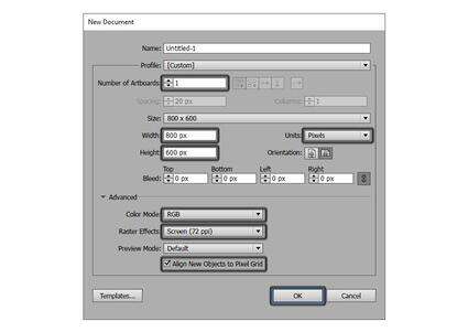
As always, start
out by creating a new project file by going to File > New or using the Control-N
keyboard shortcut, and then adjust it as follows:
Number of Artboards: 1
Width: 800
px
Height: 600
px
Units: Pixels
And from the Advanced tab:
Color Mode: RGB
Raster Effects: Screen
(72 ppi)
Align New Objects to
Pixel Grid: checked
2. Set Up Some
Layers
2.
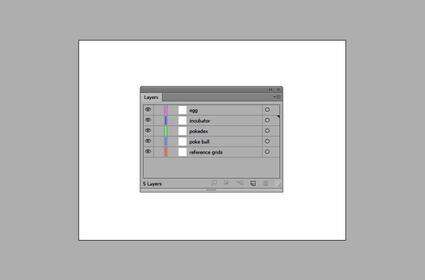
Once we have our project
file, it would be a good idea to layer it so that we can establish and maintain
a steady workflow, which will help us focus on one icon at a time.
To do this, bring
up the Layers panel, and create five
layers which we will rename using short descriptions to make them easier to
identify:
layer 1 >
reference grids
layer 2 > poke
ball
layer 3 >
pokedex
layer 4 >
incubator
layer 5 > egg
3. Create the
Reference Grids
3.
The Reference Grids (or Base Grids) are a set of precisely
delimited reference surfaces, which allow us to build our icons by focusing on
size and consistency.
Usually, the size
of the grids determines the size of the actual icons, and they should always be
the first decision that you make once you start a new project, since you’ll
always want to start from the smallest possible size and build on that.
Now, in our case
we’re going to be creating the icon pack using just one size, more exactly 128 x 128 px.
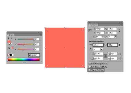
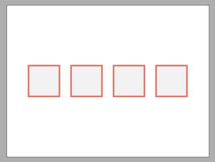
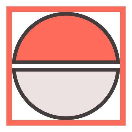
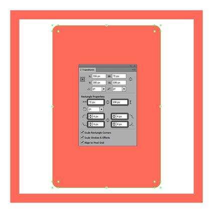
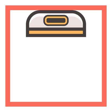
Step 1
Lock all the layers except the reference grids one, and use the Rectangle Tool (M) to create a 128 x 128 px red (#ff6b57) square,
which will define the overall size of our icons.
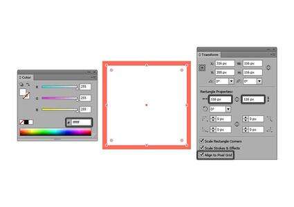
Step 2
Add another smaller 116 x 116 px square
(#FFFFFF) which will act as our active drawing area, thus leaving us with an
all-around 6 px padding.
Step 3
Group the two squares together using the Control-G keyboard shortcut, and then create three copies
positioned 40 px from one
another, making sure to align them to the center of the Artboard.
Once we have all
the reference grids in place, we can lock the current layer so that we won’t
accidentally move them, and then move on to creating the first icon, the poké
ball.
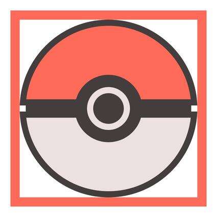
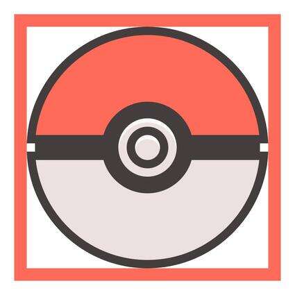
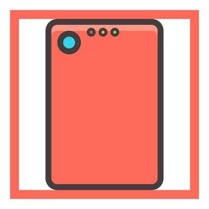
4. Create the Poké
Ball Icon
4.
The first icon
that we’re going to be creating is the iconic red and white sphere that helps
its trainer catch and house new pokémons.
Now, before we
begin working on the actual icon, position yourself on the second layer, and
then zoom in on the first reference grid so that you have a better view of
what you’re going to be doing.
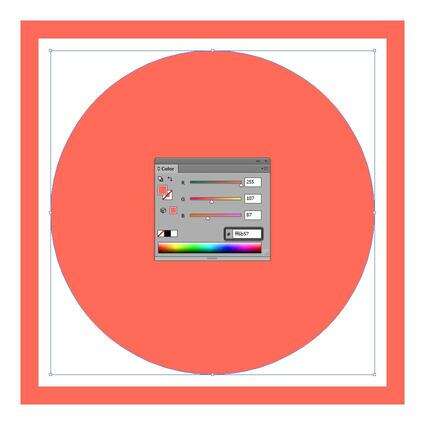
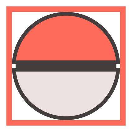
Step 1
Start by working on the upper half of the ball by drawing a 108 x 108 px circle (#ff6b57) with the
help of the Ellipse Tool (L), which
we will then position in the center of the active drawing area.
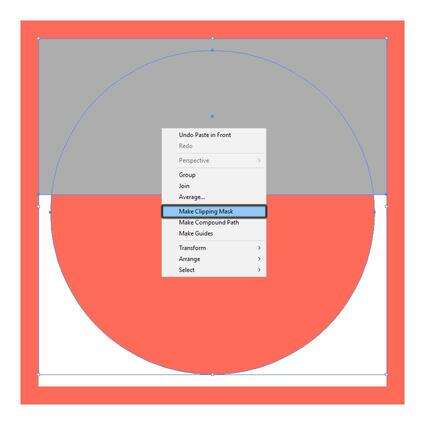
Step 2
Create a 116 x 52 px rectangle
which we will align to the top section of the active drawing area and then use
to mask the circle that we’ve just created by selecting the two shapes and then
right clicking > Make Clipping Mask.
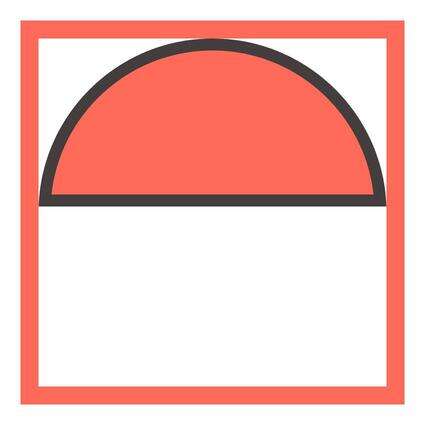
Step 3
Add the outline to
the upper section of the ball, by creating another slightly larger 116 x 116 px circle (#423b3b), which we
will mask using a 116 x 56 px rectangle,
making sure to send it to the back afterwards (right click > Arrange > Send to Back).
Also, at this point we can also group the two shapes (Control-G), since we’ll create the
lower section using a copy of them.
Step 4
Create the lower section of the ball, by grabbing a copy of the upper
half (Control-C > Control-F) which
we will have to adjust by horizontally flipping it (right click > Transform > Reflect > Horizontal) and then
changing its color from red to a light grey (#ede2e2).
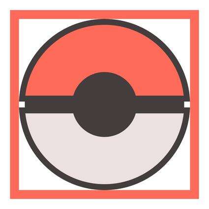
Step 5
Fill in the empty space gap created between the two sections of the
ball, by adding a 108 x 4 px rectangle
(#423b3b) in its center.
Step 6
Start working on the insertion surrounding the button, by drawing a 44 x 44 px circle which we will color
using #423b3b and then position towards the center of our reference grid.
Step 7
Add the main shape for the button’s base by drawing a 28 x 28 px circle which we will color
using #ede2e2.
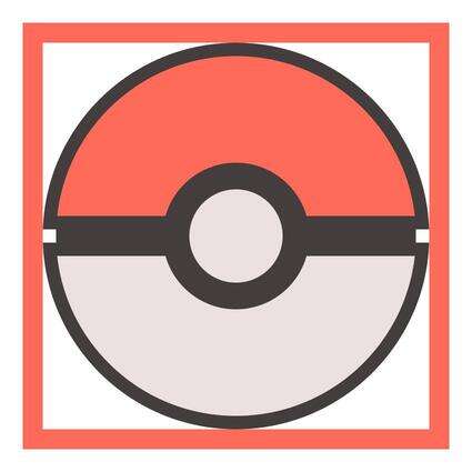
Step 8
Create the button’s outline by drawing a 20 x 20 px circle (#423b3b) which we will align to the center of the
previously created shape.
Step 9
Add the button itself by creating a 12
x 12 px circle (#ede2e2) which will go on top of all the other composing
shapes of this section, and then select and group them (Control-G) so that they won’t get separated from one another by
accident.
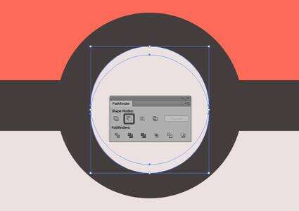
Step 10
Since at this
point we’re pretty much done working on the composing shapes of the icon, we
can now move on to adding the finishing details such as highlights and shadows.
First, double click on the grouped button to enter Isolation Mode, and then create two copies of the larger grey
circle (Control-C > Control-F).
With the copies in place, move the top one about 2 px towards the bottom and then use Pathfinder’s Minus Front
Shape Mode to create a cutout.
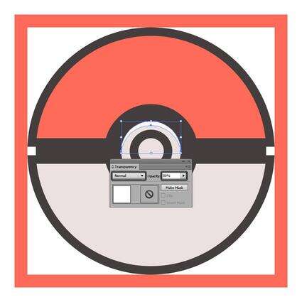
Step 11
Turn the resulting shape into a highlight by setting its color to white
(#FFFFFF) and then lowering its Opacity to
80%.
Step 12
Using the same process, add a subtle highlight to the smaller grey
circle acting as the physical button.
Step 13
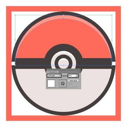
Add a similar
highlight to the upper half of the poke ball, only this time move the second
copy 4 px towards the bottom and use
Soft Light for the Blending Mode, leaving the Opacity to 80%.
Oh and don’t forget, since the red circle is masked, you’ll have to
double click on it to enter Isolation
Mode and put your highlight there, otherwise it will end up overlapping the
outline.
Step 14
Add the last set of highlights to the lower section of the ball, using
white (#FFFFFF) as your fill color and 80%
for the Opacity.

Step 15
Once you’re done with the highlights, add a shadow in the lower
section of the button, by creating a copy of the smaller outline (Control-C > Control-B) which we will
adjust by setting its color to black (#000000) and lowering its Opacity to 28%.
Step 16
Finish off the
icon by adding the final shadow in the bottom section of the grey half,
using the same color and Opacity values
as in the previous step.
Once you’re done, don’t forget to select and group all of the icon’s
elements together using the Control-G keyboard
shortcut.

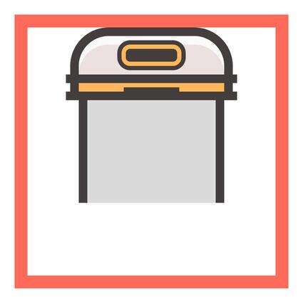
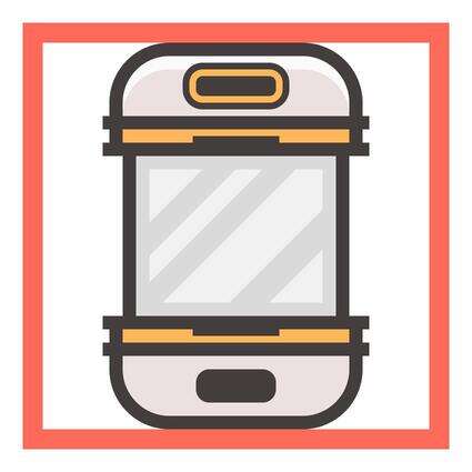
5. Create the Pokédex
Icon
5.
Assuming you’ve
already moved on to the second layer, zoom in on its reference grid and let’s
get started.
Step 1
Grab the Rounded Rectangle Tool and
create a 72 x 108 px shape with a 4 px Corner Radius which we will color
using #ff6b57 and then position towards the center of the active drawing area.
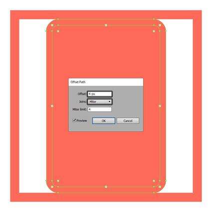
Step 2
Give the shape an outline by selecting it, and then going over to Object > Path > Offset Path and
entering 4 px into the Offset value field.
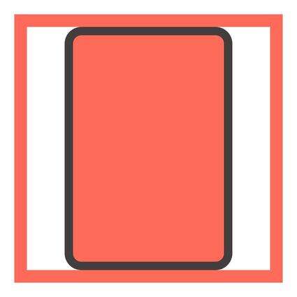
Step 3
Adjust the resulting shape by changing its color to #423b3b in order to
make it stand out.
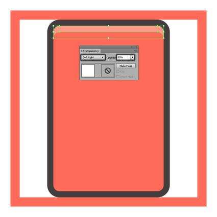
Step 4
Before we start adding any of the icon’s composing elements, we’ll want
to add a subtle highlight in its upper section, using white (#FFFFFF) as our
fill color, Soft Light as our Blending Mode, and 80% for our Opacity.
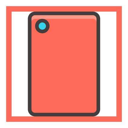
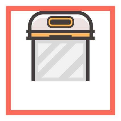
Step 5
Once we’ve added the highlight, we can create the main lens by drawing
an 8 x 8 px circle (#34d5ea) and giving
it a 4 px outline (#423b3b) using
the Offset Path method, making sure
to group the two using the Control-G keyboard
shortcut and position them towards the top-left corner.
Step 6
Next, add the little light indicators by drawing three 2 x 2 px circles (red: #d96151, yellow:
#ffb85a, green: #92db63) and giving them a slightly thinner 2 px outline (#423b3b). Group each
circle with its outline (Control-G),
and then position them 2 px from
one another, placing them towards the upper right side of the lens.
Step 7
With the light indicators in place, grab the Pen Tool (P) and draw the section line that delimits the main body
of the icon from the flip cover segment, using #423b3b as your fill color.
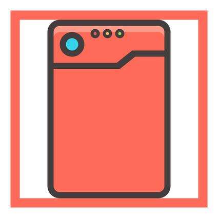
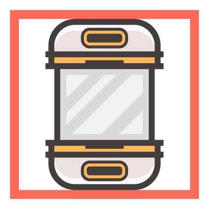
Step 8
Create the main shapes for the flip cover’s hinge by adding a 4 x 88 px rectangle (#ff6b57) with a 4 px outline (#423b3b) towards the
bottom-right section of the device’s main outline.

Step 9
Add some details
to the hinge by drawing two 4 x 4 px rectangles
(#423b3b) and positioning one on each side of the red shape.
Once you’ve added them, select all the hinge’s composing elements and
group them using the Control-G keyboard
shortcut.

Step 10
Using the Pen Tool (P), draw
the little right-facing arrow (#423b3b) and position it towards the center of
the device’s flip cover.
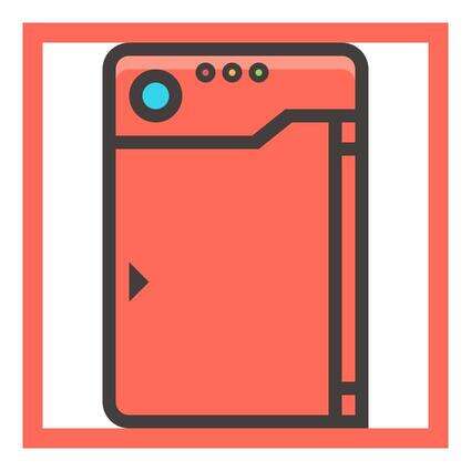
Step 11
Select the Rounded Rectangle Tool
and create a 28 x 2 px shape (#d96151)
with a 1 px Corner Radius, and then give
it a 2 px outline (#423b3b), grouping
(Control-G) and positioning the two
shapes towards the lower section of the flip cover.
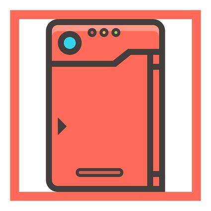
Step 12
Since at this point we’re pretty much done working on the icon’s
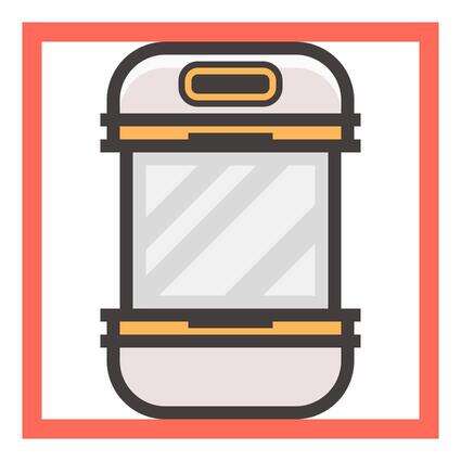
composing sections, we can start adding the rest of the highlights and shadows.
That being said, take your time and add details where you feel they are needed,
and when you’re done, select and group all the icon’s elements together using
the Control-G keyboard shortcut.

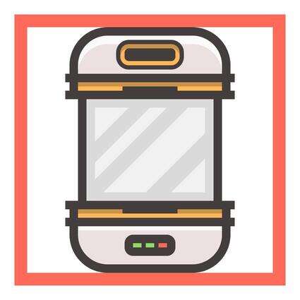
6. Create the
Incubator Icon
6.
As always, make
sure you’re on the right layer, and then zoom in on its reference grid so that
you can have a clear view of what you’re doing.
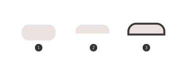
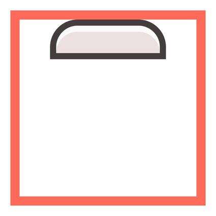
Step 1
Using the Rounded Rectangle Tool, create
a 68 x 32 px shape (#ede2e2) with a 14 px Corner Radius which we will
adjust by selecting its bottom Anchor
Points using the Direct Selection
Tool (A) and removing them using the Delete
key.
Once you’ve removed the Anchors, press Control-J to
close the path of the resulting shape, and then give it a 4 px outline (#423b3b), aligning it to the upper section of the
active drawing area.
Step 2
Using the Minus Front method, add a subtle highlight to the upper section of the incubator, using white as
your fill color (#FFFFFF) and lowering the Opacity
to 80%.
Step 3
With the highlight in place, start working on the inner panel by
drawing a 28 x 10 px rounded
rectangle with a 4 px Corner Radius, which
we will color using yellow (#ffb85a) and then give a 2 px outline (#423b3b), positioning the two shapes in the center of
the underlying section.
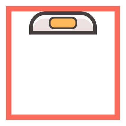
Step 4
Add the inner section of the panel using a 24 x 6 px rounded rectangle (#423b3b) with a 2 px Corner Radius, and then select all of its three shapes and
group them (Control-G).
Step 5
Grab the Rectangle Tool (M) and
create a 68 x 4 px shape (#ffb85a). Give it a 4 px outline (#423b3b)
and position the two underneath the larger section of the incubator.
Step 6
With the Rectangle Tool (M) still
selected, create two 80 x 4 px rectangles
(#423b3b) and position one towards the top side of the yellow segment’s outline,
and another one towards its bottom side.
Step 7
Before we group the composing elements of the yellow section, add
another 26 x 2 px rectangle (#423b3b)
to its center, aligning it to its bottom side.
Step 8
Create the glass panel by drawing a 60
x 48 px rectangle (#000000) which we will adjust by lowering its Opacity to 14% and then position underneath the yellow section that we’ve just
created.
Step 9
Add a 4 x 48 px rectangle (#423b3b)
to the left and right side of the glass panel, which will act as outlines.
Step 10
Using the Pen Tool (P), create the diagonal
reflections for the glass panel, by making sure to leave an all-around 4 px empty space between them and the
underlying shape. Use white (#FFFFFF) as your fill color, lowering the Opacity to 60%.
Once you’re done, select all of the glass panel’s composing elements and
group them using the Control-G keyboard
shortcut.
Step 11
Create the lower section of the incubator by grabbing a copy of the one
that we already have (Control-C >
Control-F), and flipping it horizontally (right click > Transform > Reflect > Horizontal).
Step 12
Adjust the lower section by removing the panel and the down-facing
highlight so that we can add the egg hatching progress indicator.
Step 13
Using the Rounded Rectangle Tool, create
a 10 x 24 px shape with a 4 px Corner Radius which we will color
using #423b3b and then position towards the center of the grey shape.
Step 14
Add three 4 x 2 px rectangles positioned 2 px from one another towards the
center of the shape that we’ve just created, coloring the first two using green
(#92db63) and the last one using red (#ff6b57).
Oh, and don’t forget to select them and the underlying shape and use the
Control-G keyboard shortcut to stick
them together.
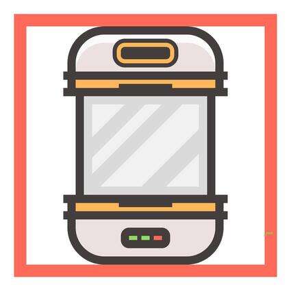
Step 15
Finish off the icon by adding a couple of highlights and shadows where
you feel they are needed, grouping all of its composing elements together (Control-G) afterwards.
7. Create the Egg
Icon
7.
We are now down to
our fourth and last icon, which as you’ll see in a moment is probably the
easiest to create due to its simple shape.
That being said, make sure you’re on the last layer, and let’s finish
this.
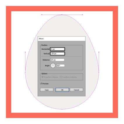
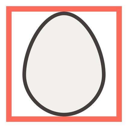
Step 1
Grab the Ellipse
Tool (L) and create an 84 x 84 px circle
(#f2f0f0) which we will position towards the bottom section of our reference
grid, leaving a 4 px empty gap for
its outline.
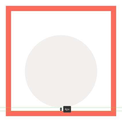
Step 2
Adjust the shape by selecting its top Anchor Point using the Direct Selection Tool (A) and pushing
it towards the top by 24 px using
either the keyboard or the Move Tool (right click > Transform > Move >
Vertical > -24 px).
Step 3
Once you’ve made the adjustments to the main
shape, you can select it and give it a 4
px thick outline (#423b3b) using the Offset
Path method.
Step 4
Add a subtle highlight (color: white; Opacity: 40%) to the upper section of
the egg and a shadow (color: black; Opacity:
14%) to its bottom one.
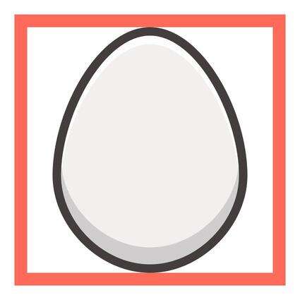
Step 5
Finish off the icon by adding the little color spots using two circles (#9fb77d),
which you will distort by pushing some of their Anchor Points towards the outside, and then give them the same 4 px outline (#423b3b) that we’ve used
for most of our shapes.
Once you’ve created the spots, select and group
all of the icon’s elements together using the Control-G keyboard shortcut.

Hooray! We Got Them All!
There you have it, a nice and easy tutorial on how to create your very
own Pokémon themed icon set using some of
Illustrator’s most basic shapes and tools.
I hope you’ve found the steps easy to approach
and most importantly learned a trick or two along the way.
