Best Software for Icon Design: Photoshop vs. Illustrator
As a designer, you've probably wondered which Adobe product does a better job when it comes to the process of creating icons.
Some love Photoshop, while others rely exclusively on Illustrator, but if you search the web, you'll find that there's no really comprehensive comparison between the two.
That being the case, I did what I always do and took the time to put the two to the test in order to find out.
If you want to learn how to make icons, whether it's a line icon pack, a set of social media icons, or maybe even a couple of Mac icon sets, you first have to find out which software is a better fit for you.
Today, with the whole minimal icon style trend, icon design is becoming more and more accessible, which means that as long as you put in the time and energy, you should be able to grow your craft, assuming you have the right tool for the job.
From a simple help icon to a development icon set, the software can and will affect the way you design your assets, which is why I want to show you how the two behave when it comes to this creative process.
That being said, let's jump straight into it!
1. What Is the Intended Creative Purpose of Each Software?
1.
Even though both Photoshop and Illustrator are part of the same Creative Cloud family of products, they actually serve different creative needs, or at least they used to until Photoshop was reimagined from a dedicated photo editing/manipulation tool into an all-around creative one, capable of doing much more.
So then, what are the main differences between the two?
Well, if we take a quick look at Photoshop’s official web page, we’ll see that Adobe advertises the product as:
At first glance, that seems to be a pretty good product description, since you get a clear idea of what the software is capable of doing.
Now, let’s move over to Illustrator and see how Adobe describes its other product:
Well, as you can see, the two are actually pretty similar in terms of their intended use cases, especially when it comes to icon design, since both are advertised as capable of handling this sort of a creative process.
So how do you actually decide which software might be better when it comes to creating icons?
Well, the answer is a bit more complicated than you might think, as we will get to see in the following moments, since it all comes down to a few key factors.
2. What Is the Artboard Support Like?
2.
The first thing that an icon designer should truly care about is Artboard support.
This is where the two set themselves apart, since Illustrator gives you the option of setting up multiple Artboards from the start, using its New Document window prompt, making the entire process really simple and intuitive.
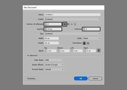
With the latest update, the software is now able of creating a whopping 1,000 Artboards, which for an icon designer is… truly amazing.
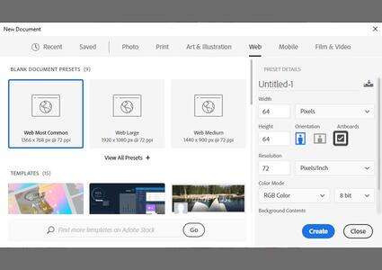
Photoshop, on the other hand, whether you’re using the new slick-looking window prompt or the legacy one, doesn’t seem to give you this ability.
With the more modern interface, you have the option of using Artboards, but there’s no actual way of setting a specific number or adjusting simple things such as spacing, the number of columns, or the distribution method.
Of course, you can go around this little setup bump by switching over to the Artboard Tool and manually adding the desired number of Artboards by clicking on one of the plus signs depending on where you want the software to position them, but that's a lot more time-consuming than it should be.
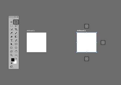
When it comes to the maximum number of Artboards that you can set up, I couldn’t find any official information, but I’m pretty sure it’s up there with Illustrator, so 1,000—I gave up after Artboard number 500.
3. How Does Basic Shape Selection Work?
3.
Now that we’ve seen how the two handle the process of setting up Artboards, let’s take a close look at shape selection.
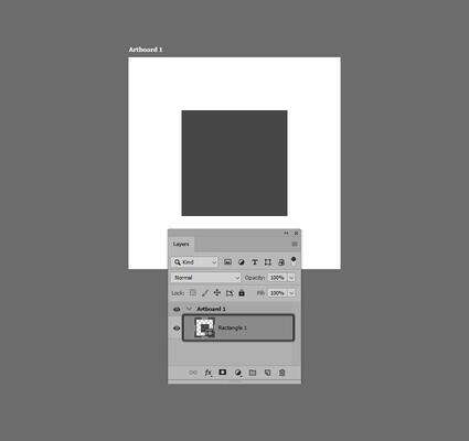
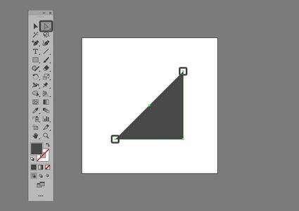
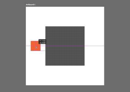
In Photoshop, to select a shape, you’ll first want to make sure that the Move Tool (V) is currently the active tool, and then you can simply click or drag over the surface of the desired shape in order to make a selection.
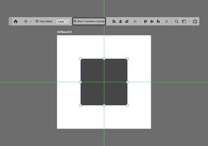
Now, the problem is that once a shape is selected, there’s no actual way of telling if the selection was made or not, which to be honest is pretty annoying.
The only way to make sure that a selection was actually made is to take a close look at the Layers panel, where you’ll get a darker background underneath the shape layer itself.
Luckily for us, we can actually change this behavior, by first selecting the shape, then going over to the top Application Bar, and then checking the Show Transform Controls option.
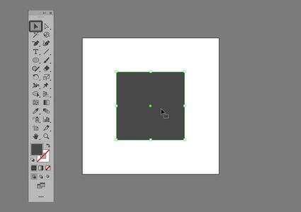
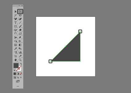
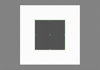
If we move on over to Illustrator, we’ll quickly see that when it comes to selection, the software does a better job since it feels more intuitive from the start, without you having to make any adjustments.
To select a single shape, we can easily do so by first switching over to the Selection Tool and then left-clicking or dragging over its surface, which will immediately bring up its bounding box, letting us know that a selection was indeed made.
Compared to Photoshop, Illustrator has an ace up its sleeve when it comes to selection, since it gives you the option of targeting and selecting multiple shapes based on similar traits such as Appearance, Fill Color, Opacity, Stroke Color, etc.
To do this, simply select one of the shapes, and then head over to Select > Same and choose one of its 12 available options.
4. How Does Basic Shape Adjustment Work?
4.
Now that we’ve seen how the two handle shape selection, let’s dig in a little deeper and see how they behave when it comes to shape adjustment.
By definition, a vector shape is composed of a closed or open path that is defined by a set of two or more anchor points.
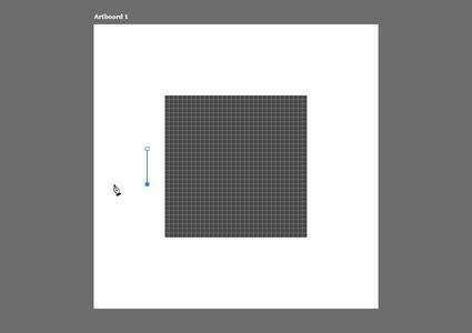
In Photoshop, you can easily adjust a shape by first selecting its anchor point(s) using the Direct Selection Tool (A), and then dragging it in the desired direction.
Illustrator uses the same basics, where you use its dedicated Direct Selection Tool (A) to select a shape’s composing anchor point, and then click and drag it in the desired direction in order to adjust the shape of the object.
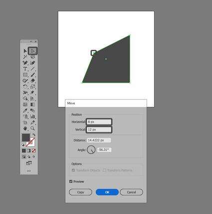
Now, compared to Photoshop, Illustrator gives you a little info window where you can see the number of pixels that the anchor point travels as you drag it around.
If you need to combine high precision with a fast workflow, you’re going to find that Illustrator does a better job, since it allows you to select the anchor and then use its Move tool, by right-clicking and then going to Transform > Move, which should bring up a new window where you can individually adjust its position on the Horizontal and Vertical axes.
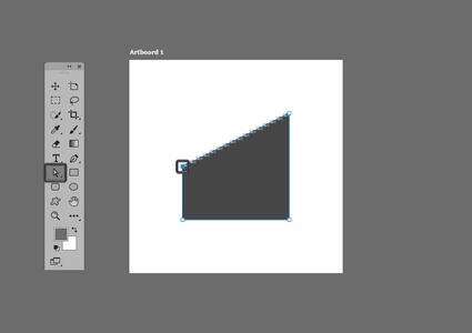
The process of adjusting the position of an anchor point is actually fun and easy to do, but what about those situations when you need to completely remove one from a shape’s path?
Well, in Photoshop, you can easily remove an anchor by selecting it using the Direct Selection Tool (A) and then pressing the Delete key, which will open up the shape’s path, as you can see.
To close the resulting path, we’ll need to grab the Pen Tool (P), click on one of the disconnected anchor points, and then close the line by clicking on the remaining one.
If we switch over to Illustrator, the software uses the same process, where in order to remove an anchor point you first have to select it using the Direct Selection Tool (A) and then erase it by pressing Delete.
When it comes to closing the resulting path, things are a little bit easier this time around, since all you have to do is use the Control-J keyboard shortcut, which will join the disconnected anchors back to one another using a straight path segment.
5. How Does Advanced Shape Adjustment Work?
5.
At this point, we’ve seen what the two can do when it comes to basic shape adjustments, so let’s turn things up a little bit and play with more advanced adjustments.
Compared to Illustrator, Photoshop lacks Pathfinder’s Shape Modes which allow you to adjust one shape using another, but hold on, don’t panic since it does have a set of similar functions hidden within one of its menus.
Before we move on, I wanted to point out that, yes, I’m aware of the Path operations panel, but believe me, it works so strangely that you’re better off staying away from it.
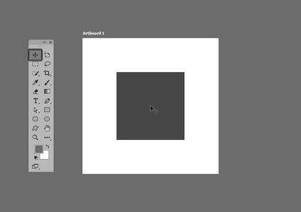
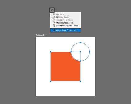
So let’s say that we have a pretty basic 32 x 32 px square that we want to adjust by removing a 20 x 20 px circle from its top-right corner.
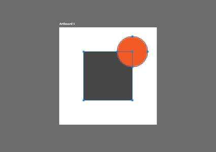
Once we have our shapes in place, we can select them both and go to Layers > Combine Shapes > Subtract Front Shape.
Now, even though the subtraction took place correctly, the path of the circle ended up being attached to that of the square, which we will want to fix by opening up the Path operations panel, and then using its Merge Shape Components function.
I won’t go over the remaining three Path operations, since they’re pretty self-explanatory. Just remember that as long as you follow the above process, you should be totally fine.
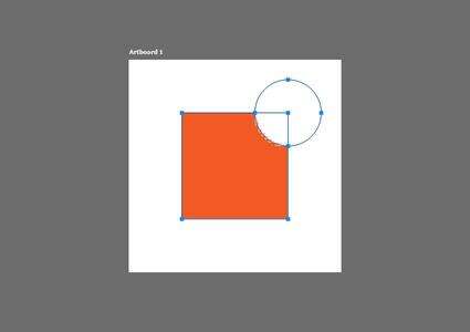
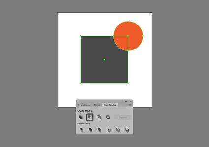
If we switch over to Illustrator, we’ll find that it comes with a different implementation of the path adjustments available within Photoshop, which to be honest are a little easier to use.
By default, the panel is hidden, so you’ll have to select multiple shapes in order for it to appear within the right Tools panel.
As soon as the panel becomes visible, we can achieve the same result as in Photoshop, by selecting the two created shapes and then simply using the Minus Front Shape Mode. It’s that simple.
Illustrator will immediately perform the operation, giving us a nice clean path.

Again, I’m not going to go over all of the remaining Shape Modes since they’re pretty descriptive, but I really encourage you to try them out, especially if this is your first time using Illustrator.
6. How Do the Two Take Advantage of the Pixel Grid?
6.
When creating small assets such as icons, you'll always find yourself in the position where you need to be able to see how their different composing shapes behave in relation to one another, and more importantly to their underlying Artboard.
This is where the ability to use a Pixel Grid comes in handy, since it allows you to see the actual underlying fabric, and thus have a higher degree of control over your shapes when it comes to anchor positioning and, more importantly, Artboard positioning.
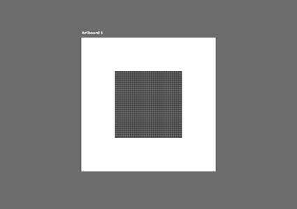
By default, Photoshop comes with the grid enabled, but as you can see, it’s only visible within the actual surface of a shape, which isn't the best approach that Adobe could have taken.
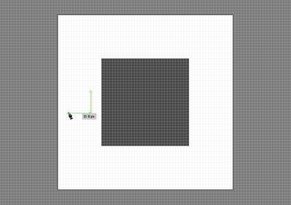
When it comes to making basic shape adjustments, the software allows us to keep track of the number of pixels that our anchor points travel, but it forces us to actually count the pixels themselves, which is only possible when using the click-and-drag method.
If you need to position a shape in relation to another, this time around Photoshop does a better job, since its smart guides and info panel help you keep a perfect track of both the horizontal and vertical movements of the shape, as long as you're using the click-and-drag method.
So far so good, but here comes the part that kind of renders the tool useless, since if you want to use the Pen Tool (P) to draw a shape using specific values, there's no way of doing so, since the Grid isn't visible outside the surface of a shape.
From what I could see, this is mainly due to the color of the Grid's lines, which can't be changed. The only solution to the problem as of now would be to create a shape that fills in the entire surface of the Artboard, and set its color to something darker like a grey, which again would require you to take extra steps.
Now, let’s switch over to Illustrator and see how it handles these type of situations.
Similarly to Photoshop, the software comes with its own dedicated version of the Pixel Grid, which can be turned on by heading over to View > Pixel Preview or by using the Alt-Control-Y keyboard shortcut.
As soon as we turn it on, we’ll quickly notice that compared to Photoshop, where the grid was visible only within the surface of its shapes, here the grid is applied to the entire document.
By taking this different approach, the software does a better job of helping you keep track of the pixel count, as we will see in the following moments.
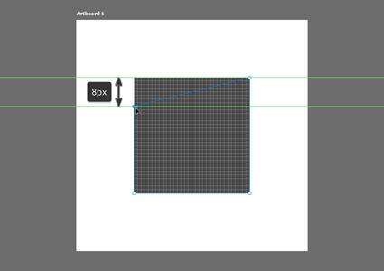
As with Photoshop, we can easily adjust the position of an anchor point and keep a perfect track of the number of pixels traveled, only this time around the entire process is easier since it comes with its own dedicated info panel.
When it comes to positioning a shape in relation to one another, we can easily do so as long as we use the click-and-drag method, since it will allow us to keep track of the pixel count using the little info panel.
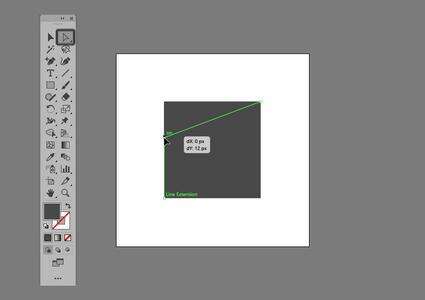
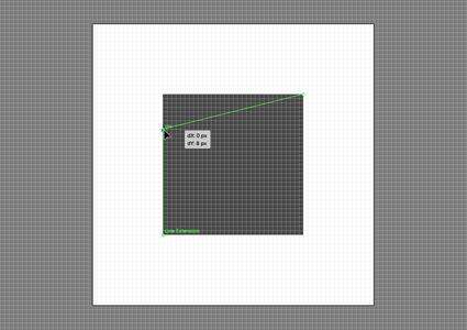
Now, here comes the part that truly sets Illustrator apart, since if we need to draw a shape using the Pen Tool (P), we can easily keep track of the distance found between its composing anchor points using the little info panel.
At this point, we’ve covered most of the basic aspects that you need to take into consideration when choosing the “right” software, which means that we can now finally move on to the conclusion part.
Conclusion
The number of advantages Illustrator has makes it the clear winner here:
better Artboard support
shape selection is faster and more intuitive
both basic and advanced shape adjustments are easier to perform
an overall better Pixel Grid experience
That being said, I truly hope this information comes in useful, and if you have any questions, feel free to post them within the comments section, and I’ll get back to you as soon as I can.
Further Develop Your Icon-Building Skills
Just finished going through this in-depth article, and feel like learning more? Well, if that's the case, you're in luck, since I took the time to put together this little list that should keep you going for the following days!
How to Make IconsAlways wanted to learn what it takes to create your own icon, but never knew exactly where to start? Well, with this article, that's going to change. You'll...
Andrei Stefan
19 Jul 2019
Icon Design
The Do's and Don'ts of Creating Line IconsLearn how to create line icons both in Adobe Illustrator and Affinity Designer, and see how you can craft a usable finished product using a few basic shapes.
Andrei Stefan
17 Sep 2018
Icon Design
10 Styles That Have Changed the Face of Icon DesignLet's explore the history and evolution of icons by looking at ten styles that have changed the face of icon design.
Andrei Stefan
07 Sep 2017
Icon Design
10 Top Tips for Creating Awesome Icons Today, I’m going to share with you ten tips on icon design that I’ve managed to isolate and put down in digital ink after doing some research from both my...
Andrei Stefan
13 Jan 2016
Icon Design
How to Scale Icons Correctly in Adobe IllustratorLately I’ve been getting a lot more technical and started exploring solutions to the different challenges that you might encounter along your creative...
Andrei Stefan
09 Dec 2015
Icon Design
How to Create Pixel-Perfect Artwork Using Adobe IllustratorAs a beginner, creating digital artwork intended for web use can sometimes get a bit frustrating, especially when you put a lot of time into a piece (be it...
Andrei Stefan
19 May 2015
Adobe Illustrator
How Apple Ended Up Leading the Icon Design TrendsHave you ever wondered how Apple actually ended up leading the design trends when it comes to icons? Well, in today's article, we're going to examine how it...
Andrei Stefan
18 Dec 2018
Icon Design
How to Make a Blog IconLearn how to create a blog icon, using nothing more than some basic geometric shapes that we’re going to adjust. If you want to learn how to make icons, this...
Andrei Stefan
19 Feb 2019
Icon Design
Illustrator in 60 Seconds: How to Create an Emoji IconLearn how to create a cute little emoji icon, using nothing more than some basic shapes that we're going to adjust in Adobe Illustrator.
Andrei Stefan
12 Jul 2018
Adobe Illustrator
How to Create a Text Editor Icon Set in Adobe IllustratorIn today’s tutorial, we’re going to tackle another icon project, in which we’re going to gradually learn how to create a set of text editor elements, using...
Andrei Stefan
07 Mar 2018
Icon Design
How to Create a Set of Music Player UI Buttons in Adobe IllustratorLearn how to create your very own set of music control UI buttons, using some of the most basic shapes and tools that Adobe Illustrator has to offer.
Andrei Stefan
01 Nov 2017
UI Design
How to Create 10 Common Icons and Their Variations in Adobe IllustratorTo celebrate our tenth birthday, learn how to create a set of ten must-have UI icons, using the most basic shapes and tools that Illustrator has to offer.
Andrei Stefan
04 Sep 2017
Icon Design
How to Create a Mobile Phone Icon Pack in Adobe IllustratorLearn how to create three of the most iconic communication devices ever made, using simple geometric shapes and tools in Adobe Illustrator.
Andrei Stefan
27 Jul 2017
Icon Design
How to Create a Transport-Themed Icon Pack in Adobe IllustratorIn today’s tutorial we’re going to take an in-depth look at the process of creating a transportation-themed icon pack, using simple shapes and tools.
Andrei Stefan
12 Jul 2017
Icon Design
How to Create a Stylish Accessories Icon Pack in Adobe IllustratorIn today’s tutorial we’re going to get our fashion on and learn how to create a stylized set of accessories icon pack, using the most basic shapes and tools...
Andrei Stefan
21 Jun 2017
Icon Design