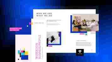
Design a Tri-Fold Brochure using InDesign
How to Make a Trifold in InDesign
1. Start InDesign. Select "New" from the File menu to create a new document. Select "Document Preset" in the New Document window; then choose "Print" from the Intent pull-down menu. Type a value of "6" in the Number of Pages box; then a value of "1" in the Start Page box.

2. Click the up or down arrow under "Page Size" to until you reach a value of 3.6875 inches for the width, and 8 inches for the height. Type a value of "1" in the Columns box; then enter a value of 0.5 inches for the top, bottom, left and right margins. Click "OK."
3. Select "File"; then choose "Document Setup" to add a bleed to the page. Open the Pages panel menu. Click the triangle in the upper left corner of the panel to bring up the sub-menu. Scroll to "Allow Pages to Shuffle" and deselect it if there is a check mark next to the option. Move the pages in the thumbnail window to create three pages next to each other for both sides of the paper.
4. Select the "Master Options" tab in the Pages panel. Name the first master that was automatically created in the thumbnail pane "1 - Outside." Create a second master page by clicking the triangle in the upper-left hand corner; then scroll to "New Master." Name the new master "2 - Inside." Click the "Page" tool and select the "2 - Inside" master. Enter 3.625 for the width in the Control panel settings.
5. Slide the thumbnail for “2 - Inside” over the left-hand page on the Outer spread and the right-hand page on the Inside spread.
The anatomy of a good brochure design
Just like flyers, you simply can’t avoid brochures. Unless you’ve been living under a rock for the past 20 years, there is no chance you weren’t handed one. Whether we’re talking about a bi fold brochure, a tri fold brochure, or any other type of brochure for that matter, it is the brochure design that caught your attention first. Based on the subject and the design, you then either threw it away, or you opened it and read it. If you are handed a brochure of something you have 0 interest in, chances are you might still open it if the design catches your eye.
When it comes to brochures, the design needs to be on point, so if you are wondering how to create a brochure that stands out, then this article is for you. In what follows I will share some brochure design tips, brochure examples, and brochure templates to get you started. However, before we get things started, let’s answer a very important question:
What is a brochure?
There are different brochure definitions, but they basically say the same thing. Simply put, a brochure is a document, either made from paper or digital, that contains information or promotional content. Most of the time, a brochure is mainly used as a marketing tool. Companies often use brochures to promote their products or services. There are different types of brochures, and different ways to distribute them, but more on that, a little bit later.
What do you do before designing your brochure?
There are a few things you should consider before designing your brochure. Being aware of this information will help you create a brochure specifically for your target audience’s needs. So, let’s start.
Know your brand
Before designing your brochure, it is important to know everything about your brand: its story, its mission, and its values. Knowing all of this information will allow you to create and uniformly deliver all your marketing materials, thus maintaining brand consistency. It is important to maintain brand consistency across all channels, so you need to make sure that all promotional materials (brochures in this case) follow the same branding guidelines.
Your brochures should promote your brand’s image. This means using the same brand elements across all publications including the logo, and the font, and maintaining the same overall aspect. Sure, the overall design will vary depending on particular cases, but as long as these branding kit elements are properly used, your brochures will deliver a consistent message. Think of these branding elements as your signature. They represent what you are, as a company.
Know your audience
Before you start thinking about brochure design ideas, you need to think about your target audience. Is your brochure business-related? Is it an event brochure? Knowing who your target audience is will allow you to adjust the message, visuals, and text.
For instance, a brochure designed for elementary school students will have a different text and visuals than a real estate brochure. What works for one purpose might not work for another and vice-versa.
School brochure VS Real estate brochure – They target a different audience
You can see the difference between these two brochure templates. The school template contains lively colors, suitable for the target audience – children in this case. On the other hand, the real estate one has a more serious look, and a different color palette, suitable for a business.
The two brochures deliver the messages in different ways: a more playful tone for the school brochure, with catchy and inspiring quotes. The real estate one is more serious. It gets straight to the point, it offers information about the company, solutions, and testimonials from clients.
I created the two with different purposes in mind. Speaking of purpose…
Know the purpose of your brochure
What are you trying to accomplish with your brochure? Do you want to bring people to your store? Do you want them to visit your website? Or do you want to draw attention to a certain cause? Or maybe to invite people to an event?
How do you want to deliver the brochure? Do you want to create a digital brochure and share it online? Do you want to print a brochure and then share it physically? Having answers to all these questions is important, as the answers will influence the brochure design.
Based on the brochure’s purpose you will need to choose a brochure type. There are lots of them to choose from, but some of the most popular are bifold, trifold, and z-fold. Each type serves a purpose and is often used in different situations.
Z-fold brochures, for example, are used when the brochure contains lots of visuals. The bifold is the most popular and it is often used for promoting products and services. It has only 4 pages and it is easy to skim through it.
Different types of brochures
The brochure type influences the brochure size and both of them influence the brochure layout design. Because of this, the amount of information you can include in them varies. For example, a bifold (4 pages) brochure will contain less information than a trifold (6 pages) one because there is less content space to work with. The less space you have to work with, the more precise you need to be with the message.
Now that I’ve shared some information on what to do before designing a brochure, let’s see what information should be included in the brochure.
What information should be in a brochure?
When designing a brochure, you should know where each piece of information should be placed. What to put in the back of the brochure, on the cover, and so on. In the next paragraphs, I will present some must-have elements that your brochure should contain. Let’s take a look at them.
A catchy headline Purposeful visuals Concise text Branding elements Contact information Call to action
Let’s take a closer look at each of these elements.
1. A Catchy Headline
When it comes to the brochure design, the headline is one of the most important elements. Think about it: it is among the first things you see when you receive a brochure.
The headline should be quick and concise. It should grab the attention of the reader in no time and deliver the right information in just a few seconds. There are different ways you can do so. For example, you could ask a question: “Where would you travel today?” as a headline for your travel brochure. Or, you could use the headline to make it clear that you will offer a solution: “How to buy a house in 5 easy steps”. You could invite people to an event: “Come see your favorite band”.
Examples of catchy headlines
If your headline game is strong, it becomes easier to grab the attention of the targeted readers and get them to go through the brochure. If your headline game is weak, your precious brochure might end up being discarded in the trash can.
When creating a headline for your brochure, you have to be sure the chosen font is legible, clean, and complementary to your brand image. Some good Sans Serif fonts for brochure headings are Oswald, Aquatico, Moon, Lombok, Bernier, and Pier. With Flipsnack, you can even upload your font and use it in your publications. This will allow you to maintain the so-important brand consistency I mentioned earlier.
2. Purposeful Visuals
Besides the headline, the cover picture is another element of great importance. A cover image, just like the headline, draws attention to the brochure. It needs to stand out, but it should be consistent with the overall brochure design. The same principle applies to all the brochure’s pictures, not just the cover.
Pictures are worth a thousand words. Visuals comprise a variety of things, including HD images, icons, graphical elements, and so on. They will make your design easy to navigate. Look for meaningful images and illustrations for your brochure to add visual interest to your design.
Examples of outstanding visuals
It might be difficult to decide which pictures to include in your brochure, but you should base the decision on how on point the image is. Does the picture add anything of value for the reader? Is it complementary to the text, or did you add it there just because you liked the way it looks?
If you do not have a budget for your product images, stock images are also an option. That being said, try to avoid using them for the sake of brand credibility. However, if stock photos are the only choice you have, then make sure that the images fit the message. If you offer a service, add a picture related to that service. If you’re a travel agency, maybe add a picture of the most popular vacation destinations.
3. Concise text
The text you include in the brochure is important, as it has the power to communicate your brand’s message to the readers. The words you use should be clear enough to send your message. This means that you should use simple words, which are easy to read and understand. If you want to deliver a message regarding your brand, boost sales, or persuade repeated purchases, using complicated words won’t help.
The subheadings should offer precious information; if people skim through the brochure, the headline and subheadings should offer a clear idea of what your company is about.
Regarding the message, try to stick to a single one. If the purpose is to invite people to your event, the message should be about that event only. Adding too many messages might be counterproductive, as it might confuse the readers. Know the purpose of the brochure!
Writing is a creative process, it takes time, and lots of rewriting will be involved. You can’t just add words to a brochure and expect them to stick. There should be a whole content strategy plan in place when creating content for a brochure. Stay on top of the latest content trends, and know what works and what doesn’t. Try different text versions, ask for feedback, and see which version has the biggest positive impact.
One good practice is writing the text, reviewing it, and then adjusting it accordingly to the type and size of the brochure. Trim the fat so to speak, and keep only relevant information inside the brochure. If sentences contain words that do not add anything of value, feel free to remove them. Remember, you have limited space to work with, so you should use it wisely.
4. Branding Elements
As I previously mentioned, it is imperative to know and promote your brand, and one of the best ways to do so is to be consistent from a visual point of view.
The logo is the face of a business, which is why you should place it somewhere visible in your brochure. A good brochure design always has a logo that can represent the business in all possible ways. Make sure it isn’t too big on the cover. Play around with different sizes and alignments, and see what works best.
Branding elements: fonts, colors, logo
Branding is not just about the logo, though; it is also about the way you deliver a certain message. Companies often use their own fonts and have well-established typography rules. Custom brand colors are also important, as they enhance a company’s visual identity. All of these elements combined will lead to something spectacular.
5. Contact information
You should include your contact information in the brochures you share. If your brochure is a physical one, the contact options are standard: website link, a physical address (if it is a viable option), email, and a phone number. As a rule, try to include at least two kinds of contact information, to make sure that you can be reached in different ways.
Things are a little bit different when it comes to digital brochures because they offer interactivity. Let’s say that you are interested in a modern brochure design. You can use one of Flipsnack’s brochure design templates, edit it to your will, and then you can add different interactive elements to it. One such element is the embed feature, which allows you to add a map of your location in your brochure. This allows the reader to find your location with ease. The feature is excellent for an event brochure, or if your business has a physical location.
This way, you could make the contact information I mentioned interactive, meaning that readers could easily contact you with the click of a button. On top of that, a digital brochure offers options a regular brochure can’t: social media buttons.
Sure, you could add a link to your Facebook profile, but with a digital brochure, you could add links to all your social media accounts. The good part is that the design would not be altered too much, as the text would be revealed only when clicked. Think about the extra exposure such an option would bring.
6. Call to action
Now that you’ve managed to grab your audience’s attention with a proper headline and text, it is time to include another important element of any brochure: the call to action.
Calls to action push the viewers to the verge of following the desired action. You should carefully select the call to action based on the brand. If you run a charitable organization, your call to action would be related to donations or volunteering; similarly, if you are a mentor, then your call to action will be something about downloading your guide.
A powerful call to action does not just tell the readers what to do, but it also gives them the right motivation to do so.
In the case of product brochures, you can offer something for free, or maybe a discount. People love free stuff, and that might be the extra motivation they need to get in touch. Don’t think of it as something scammy, as a trick to convince people of doing something. Think of it as an opportunity for people to sample the products or services you offer. Make it worthwhile for your readers to take action.
Put some thought into creating the CTA message and make it stand out from the rest. Make the text bigger than the rest, and use a message which makes the reader understand what you are offering. A suitable message would be “Find a house today!” or something of that manner for a real estate company. Choose a concise, well-written call to action and let it do its magic for you!
What makes a good brochure design?
Now that I’ve covered what a brochure should contain, it is time to see how it is structured; where all these elements are included, and in what pages of the brochure. The information I’m about to present is based on a trifold brochure design, but the core principles remain the same. Let’s see how to design a brochure that stands out.
The Front Cover
The brochure cover is one of the crucial components of the brochure. Its purpose is aimed at grabbing the attention of the audience and fabricating an emotional bond that compels the audience to read the brochure. This is where you should place the headline and the cover image, for obvious reasons. The cover should also contain your company’s name to make it stand out and allow people to remember you even if they don’t open the brochure.
Hopefully, that is not the case, the headline and the visual managed to accomplish their purpose, and people opened the brochure. The next thing they will see is…
The Inside Flap
This section is also called the inside cover, and its role is to explain how your business can help potential customers. It should provide solutions to their problems, it should raise awareness regarding a cause, it depends on the brochure’s purpose.
The inside flap is often considered the brochure’s most important page, as it should “hook” people into reading more information. For this reason, make sure there is enough white space or negative space around the text to let the brochure breathe; a crowded copy would be difficult to read.
The Content
The content, also known as the body, or the interior, is a brochure’s main section. If the cover is designed to gain attention, the inside flap to make them interested, and the content should provide all the necessary information regarding the brochure’s purpose.
This is the section that delivers your branding message, it offers information about your product, your company, and your event. Due to the limited space, the text should be concise and clear; it should deliver only necessary information which can be understood in one reading. As I mentioned in the copy section if a piece of text does not add anything of value to the reader, remove it. If it is difficult to understand, rewrite it.
Put some thought into this section’s design, both regarding the text and the imagery. Use subheadings for the text and structure it into small pieces. Use high-quality pictures complementary to the text.
The Outside Flap
While the inside flap is used to hook the readers into keeping on reading the brochure, the outside flap is often used to reward them for doing so. This section usually contains a “reward” for the readers, and in most cases, it is a discount of some sort, but it can also include a list of tips & tricks that help the readers.
Maybe a discount coupon, or a scannable QR code for a free item. Or, offer a discount if people come into the store with the brochure. You could include a lead form in your digital brochure, so people can subscribe to your emails for some benefits. As I mentioned, make it worthwhile for them as well.
The Back Cover
Finally, the brochure’s last page: the back cover. This section has the purpose of making people engage with your business in different ways: convince them to make a purchase, donate to your cause, visit your event, or follow you on social media.
What goes on the back of a brochure?
This page contains different elements and we’ll go through them one by one. Now that you have given the reader all the information they need, it’s time to bring it home with a call to action. As I already mentioned, the call to action should be clear, and engaging, and it should stand out visually.
The back cover should also contain the contact information I previously went through. Once again, a physical brochure is limited in regards to the amount of information you can add. If you want to add more than a phone number or an email address, a digital brochure is the better option.
This is the common practice for a trifold brochure design, but the same rule applies to any type of brochure. Of course, you can make slight adjustments if you need to.
Brochure templates
Now that I’ve covered which information should be included in the brochure, and what makes a good brochure design, let’s take a look at some examples.
If you are interested in some brochure design ideas, then look no further, as Flipsnack offers a wide selection of brochure templates you can use as inspiration. Here are 3 of our template examples to get you started.
Business Brochure Design For PDF Download
Take a look at this business brochure design for PDF download. On the front cover, you can see the business’s name, and the inside of the brochure contains a message from the director, important clients the company has worked with, some achievements, and client testimonials.
The imagery, mainly in black and white, is a perfect match for a business. It is serious, professional, and classy. The information from the template is just a placeholder; you can edit it to your liking: change the pictures, and the text, and personalize it to suit your needs.
Editable MLS Realty Brochure Template
Here is another example, this time of an editable MLS realty brochure template. The front cover features the company’s name, and the image features a building. One look at it, and you realize that the brochure is related to real estate.
The inside section shares some information about the real estate agent, but the property takes the spotlight. The brochure features property information, as well as some useful information about the neighborhood it is located. This template is MLS compatible, which means that you can design the brochure as you wish, connect your MLS database to Flipsnack, and quickly make changes to the brochure depending on your presentations. You can keep the brochure design intact, and only change the information related to the property.
Finally, the last page features the company’s name again, with different contact details. The design features pleasant colors, it is welcoming and homey.
City Vacation Brochure Template
Last but not least, we have a city vacation brochure template. This template draws attention through its playful colors. The title is in both color and black and white, but the brochure cover takes the spotlight in this case. On the inside, you can find information about the different activities you can do in Venice, and some information about discounts for guides, hotels, and so on. The outside cover contains the ever-useful contact details.
There you go, three different brochure templates, each with its look, designed with a different purpose.
How to design a brochure in Flipsnack
If you are interested in designing your own brochure, then Flipsnack is the perfect solution for it. We offer a wide selection of brochure templates to choose from, and the process is really simple. In a few easy steps, you can personalize your brochure:
Choose a template that you like, such as this interactive brochure template, for example. Open it in our Design Studio, and edit it to your will. Customize the text: choose the font, and edit its weight and size. Set your typography and deliver the message according to your needs. Personalize your brochure by uploading your images or videos. If you lack inspiration, choose stock photos and videos from our Pexels, and Pixabay library. Take advantage of our interactivity feature. Take your brochure to the next level by using elements such as CTA buttons, captions, tags, or social media buttons. Add a personal touch to your brochure design by uploading your own brand’s colors, fonts, and logos. Brand consistency ‘till the end! Download or save your brochure. Make it public, or share it by email with selected individuals. Choose from our different sharing options.
If you are inspired, you can create your brochure from scratch, having full control over the brochure design. If you already have a brochure, you can save it as a PDF, upload it in Flipsnack, and then use our Design Studio to make it interactive.
Brochure design FAQ
There are different questions people ask when it comes to brochures, and in the following section, I’ve gathered the most popular ones. I hope that the answers will be helpful and will shed some light on the process of creating a brochure.
What are the different types of brochures? There are different ways to categorize brochures. You can categorize them based on their type of fold. For example, there are bi-fold, tri-fold, gate-fold, and z-fold, just to name a few. The type of fold influences the design, and the amount of information you can include in the brochure.
Then you can categorize them based on the subject: travel brochures, business brochures, real estate brochures, and so on. Once again, the subject is important when it comes to the content you include in your brochure.
You can also divide them into paper or digital brochures. Brochures are traditionally made out of paper, but in recent years digital brochures or e-brochures have gained popularity. Why? Because they are cheaper to produce, as there are 0 printing costs, easier to share, and they are interactive. For this reason, this article will mainly focus on digital brochures. What format does a brochure have? Even though brochures come in different sizes, all of them follow a similar format. In the case of a tri fold brochure:
• The brochure cover should contain the company information and the headline.
• Use the inside flap and content to raise awareness and provide all the necessary information about the product/service/event.
• The outside flap should provide an incentive for the reader: discounts, free items, tips, and so on.
• The cover should contain the contact details and a call to action. What is the purpose of a brochure? A brochure allows companies to promote their products and services. Brochures can be used for marketing purposes, and they offer different benefits: they are easy to distribute, they create engagement opportunities, and they are large enough to contain the right amount of information. How do I design a brochure? • Know your brand and maintain brand consistency in the brochure design, both in text and visually.
• Be aware of your target audience and create the content with the audience in mind.
• Know the purpose of your brochure. Based on the brochure design, choose what type of brochure to create, how to share it, and with whom. What is the best program to create a brochure? There are different brochure makers to choose from, but Flipsnack is a great all-around solution. Through Flipsnack you can upload your PDF, create a brochure from scratch, or choose from a large selection of brochure templates to get you started. You can use different interactive features to make your brochures more appealing to your customers.
When it comes to sharing, Flipsnack offers different possibilities: by mail, direct link, through social media, or you can directly embed your brochures on your website.
What does a brochure contain? Each brochure should contain the following elements: a headline, brand elements, contact information, a call to action, text, and visuals. Each of them should be placed strategically, and that is what makes a good brochure design.
The anatomy of good brochure design. Takeaways
When designing your brochure, make sure it has all the elements we talked about above. Here are some main takeaways to consider when designing your brochures:
Front covers always steal the show, so make sure they fabricate an emotional bond with readers.
The flap should be engaging enough to keep the momentum going.
The text should be concise. Avoid adding superficial information just for the sake of it.
Use high-quality images to support your text and headlines.
The back cover of the brochure should conclude the information with a clear, yet powerful call to action.
Make the contact information clear and prominent.
If your brochure is digital, add interactive elements to it.
If you are looking for brochure design inspiration, Flipsnack can help you.
And that’s it! Make sure you check out Flipsnack’s template inventory for all sorts of creative and engaging brochure designs.
Design a Tri-Fold Brochure using InDesign
This tutorial will take you through the steps of creating a basic tri-fold brochure. There are endless variations on this but the underlying idea is to keep the document structured and to consider how you want a viewer to experience the information. Designing a tri-fold brochure presents a small difficulty as the finished product is three dimensional and is intended to be folded – you will see on page two of the document, the front panel appears on the right. The copy used in this tutorial is actual advice for the production of a brochure, I hope you find it helpful.
For this document, you will need to download these three typefaces – Montserrat Bold, Medium and Regular – and install them. You will also need to download these three images – they are in a zip file and will need to be unzipped, if you are using a MAC it will most likely do this automatically and generate a folder, if you are using a PC, you should be able to double click the file and extract them to a new location. After you unzip them, copy the folder to the location where you are saving your InDesign layout.
1. Start a new document 51p0 x 66p0 (8.5″ x 11″) in the vertical orientation. Make 2 non-facing pages with 3 columns with a 3p0 (1/2″) gutter and 1p6 (1/4″) margin on all sides. Click Create.
2. In the Pages Panel double-click the A-Master. This will allow us to make guides that appear on all pages of the layout.
Go to the LAYOUT menu > CREATE GUIDES and make 3 column guides with 0p0 gutter and fit the guides to the page size – this will show you exactly where the brochure will fold. Click OK.
Go back to the LAYOUT menu > CREATE GUIDES and make 3 rows with 0p0 Gutter, fit the guides to the margins. Click OK. This will provide a basic modular grid for the layout.
3. In Pages Panel double–click on back into Page 1 and save your file. Name it Brochure.indd and place it in the folder you made for this project.
4. Open the Swatches Panel (WINDOW menu >COLOR>SWATCHES) and create a new swatch by clicking on the new swatch icon or by going to the menu.
Make a swatch with the following formula C=0 M=79 Y=69 B=14 Name the swatch Salmon. Click Add.
With the New Color Swatch window open, make another swatch with the following formula C=0 M=0 Y=0 B=65 name the swatch 65% gray. Click OK.
5. On page 1 use the content frame tool (the rectangle tool with the X through it) to create a series of Content Frames – three on the top row with each frame completely filling a grid rectangle. On the second row make a frame that spans two grid rectangles on the left and middle and another that fills the rectangle on the right. Finally, on the bottom row make 3 frames (exactly like the top row) Zoom in to ensure that the frames are snapped to the guidelines and the edge of the paper (not the magenta colored margin lines.)
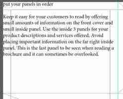
6. Open this text file and copy the first headline and paragraph “put your panels in order” and the paragraph starting with “Keep it easy…” With the type tool click on the top left content frame – this will turn the frame into a text frame – and paste in the copied text.
Paragraph and Character Styles are essential to keeping your brochure looking professional. By using paragraph styles the same type treatment can be applied throughout the document and changes to the style can be made all in one place. Character styles allow you to make discrete changes to the paragraph formatting and again, allows you to make changes throughout the document all in one place.
7. Highlight the paragraph you just pasted into the frame (“keep it easy…”) and in the Character Panel change the height to 11pts and the leading (the space between lines of text from baseline to baseline) to 16pts. Keep the typeface the default Minion Pro Regular.
With the paragraph still selected, go to the WINDOW menu > STYLES > PARAGRAPH STYLES and click the new paragraph style icon at the bottom of the panel. Double click Paragraph Style 1 and rename it Body Text.
8. Highlight the Headline (“put your panels in order”) and in the Character Panel change the typeface to Montserrat Bold at 14pt height with 16pts of leading. Go to the Character Panel Menu and make the type All Caps.
With the paragraph still selected click on the new paragraph style icon to make a new style, then double-click PParagraph Style 1 and rename it Headline.
9. Deselect all text by clicking out in an empty area of the artboard. Go to the WINDOW menu > STYLES > CHARACTER STYLES. Click on the new character style icon and then double-click Character Style 1 and rename it, Salmon. In the Character Color Tab change the color to the Salmon swatch. This style will only change the color of a selected piece of text but retain all other formatting from the Paragraph Style. Make two more styles, one that changes the color to white (paper) and the other that changes the color to 65% gray.
10. Copy the remaining headlines and associated paragraphs from the Brochure file into the indicated text frames.
Apply the Headline Paragraph Style to each headline and the Body Text Paragraph style to each paragraph. Save your file.
11. At this stage, the text occupies the entire frame which makes it look like its running into other frames, to give the text some space we will inset the text within each frame. Select all text frames on this page (hold down the Shift key to make multiple selections) and go to the OBJECT menu > TEXT FRAME OPTIONS and change the Inset Spacing for the text frames to 1p6 (1/4″) on all sides.
12. Deselect everything, then select the two frames in the middle column and change the fill color to Salmon. Select the text frame on the right and change the fill color to 65% Gray.
13. Highlight all of the text in the Gray frame and apply the White Character Style. Apply the White Character Style to the Salmon colored text frames. Highlight the headlines in each of the text frames on the right and change the Character Style to 65% gray.
14. Copy the pull quote from the brochure text document (“a poorly designed brochure …”) and with the Type Tool paste it into the top right text frame. With all the text selected click on [None] in the character style panel [Basic Paragraph] in the paragraph style panel – this resets the text to all default properties.
With the text still selected change the font to Montserrat Regular at 22pts height and 30pts of leading. This typeface does not have an Italic version but InDesign allows you to skew text to make it appear Italicized, expand the Character Panel and change the Skew to 20 degrees.
Apply the Salmon Character Style to the text. Go to the OBJECT menu > TEXT FRAME OPTIONS and change the Inset Spacing for the text frames to 1p6 (1/4″) on all sides. Save the File.
15. This next step involves placing in the images that were downloaded prior to the first step, make sure they are in the folder for this project so that you can find them easily. Select the content frame the occupies the two grid squares on the left-hand side middle row. Go to the FILE menu > PLACE and select Designing.jpg, then go to the OBJECT menu > FITTING > CONTENT AWARE FIT (or FILL PROPORTIONALLY if you are using an older version of InDesign.) Select the bottom right content frame and go to the FILE menu > PLACE and select Brochure.jpg, then go to the OBJECT menu > FITTING > CONTENT AWARE FIT. Save your File.
16. In the Pages Panel double-click on page 2. Select the content frame tool (the rectangle tool with the X through it) and draw a rectangle that occupies the two large grid rectangles on the top left side. Draw another rectangle below that fills out the bottom left grid rectangle. Draw a rectangle that fills the entire right-hand side from the right vertical guide to the page’s edge and from top to bottom. Draw another content frame in the middle panel, this one will be the size of the margins (the magenta lines) only. Zoom in to ensure that the frames are snapped to the guidelines.
17. Select the top left panel and change the fill color to Salmon, change the bottom left panel and change the fill to %65 Gray. Select the right-hand panel and go to the FILE menu > PLACE and select Cover.jpg then go to the OBJECT menu > FITTING > CONTENT AWARE FIT (or FILL PROPORTIONALLY if you are using an older version of InDesign.)
18. Select the middle content frame, go to the Stroke Panel (WINDOW menu > STROKE, or also now included in the Properties Panel) and change the Stroke Weight to 3pts and set the stroke to the inside and change the color of the stroke to Salmon. Save the file.
19. Go back to the brochure file and copy the paragraph starting with “A brochure will increase… ” then paste it into the top left rectangle (with the Salmon fill) With all the text selected click on [None] in the character style panel [Basic Paragraph] in the paragraph style panel – this resets the text to all default properties. Change the typeface to Montserrat Medium with a height of 16pts and leading of 25pts, apply the White Character Style. Change the paragraph alignment to Right Align.
With the text frame selected go to the OBJECT menu > TEXT FRAME OPTIONS and change the Inset Spacing for the text frames to 1p6 (1/4″) on all sides.
20. From the Brochure file copy “headline ideas for your brochure” as well as the following paragraph that begins with “Gather some examples…” and paste it into the %65 Gray rectangle (the text may be invisible at this point because the type may be the same color as the box – highlight the pasted text and change the character style to White) Apply the Headline Paragraph Style to the headline and the Body Text paragraph style to the paragraph. With the text frame selected go to the OBJECT menu > TEXT FRAME OPTIONS and change the Inset Spacing for the text frames to 1p6 (1/4″) on all sides.
21. Copy the next 4 paragraphs from the brochure file From “Bring attention” to “explanations and definitions?” Paste it into the middle content frame. Change all headlines to the Headline Paragraph Style and the Salmon Character Style, change all of the paragraph text to the Body Text Paragraph Style and [none] for the Character Style. With the text frame selected go to the OBJECT menu > TEXT FRAME OPTIONS and change the Inset Spacing to 0p6 for the left and right and 1p6 for the top (uncheck the chain link icon to change separate values.)
22. Draw a content frame in the center grid rectangle of the right-hand panel, Copy the title of the brochure “how to design…” and paste it into the content frame with the type tool. With the text selected change the text to the White Character Style, change the typeface to Montserrat Bold with a height of 36 pts and a leading of 50pts, change the text to All Caps .
23. With the text frame selected go to the OBJECT menu > TEXT FRAME OPTIONS and change the Inset Spacing to 1p6 for the left and right and leave the top and bottom at 0 (uncheck the chain link icon to change separate values.)
24. Save your File and go to the FILE menu > EXPORT to export it as Adobe PDF (print)