How SaaS subscriptions brought skeuomorphism back to web design
This essay was originally published on Capiche , a secret society for SaaS power users, building a new community of people who care about software to make the SaaS industry more transparent, together.

Did you know we have an online conference about product design coming up? SPRINT will cover how designers and product owners can stay ahead of the curve in these unprecedented times.
When the team that built Wunderlist set out to build something new, its whimsically designed landing page got all the attention.
Wunderlist itself was a final hurrah to the skeuomorphic design that the early iPhone popularized, launched only a couple years before iOS 7 decreed flat design was the next big thing. With paper-like notes, bubbly buttons, and background photos of brick and wood, Wunderlist felt more like a real-world thing unconstrained by silicon and screens.
Pitch, their team’s new presentation app, didn’t bring back digital felt and paper. Instead, it showcased the newest thing in software branding: 3D, clay-style graphics that look more like kids’ toys than digital tools.
Art, so often, reflects the technology of its day. Charcoal on cave walls. Bronze cast in clay. Pigment infused parchment. Letters pressed.
And so it has been with software landing pages, where form followed function and changing technology enabled new design styles. But who would have foreseen software’s switch to subscriptions changing today’s state of the art?
Is this the real world?
“This is the BBC” was branding enough for decades of radio news. Simple technology, simple branding.
Television required show and tell, an identification logo or ident as they came to be known. Thus it fell to WWII-era poster designer Adam Games to decide how the BBC should “identify itself to viewers” with “something more exciting than a selection of test cards in between the programmes.”
Technology inspired —“The symbol must move”—and limited. Screens of the time showed only 405 lines of detail, and animation tools were decades away.
So the poster designer teamed up with a sculptor to build a wire and wood model, with a motor and lights to fake animation. Just enough to create the bat wings logo—BBC’s first moving ident.
Technology marched on, and with it the state of the art. The BBC welcomed color TV nearly two decades later with a motorized globe in a mirrored box, color added during the broadcast. And by 1985, computer technology finally matched the BBC’s ambitions as the first digitally rendered globe proceeded the nightly news.
And then software-powered design was everywhere, following the same progress as the BBC’s logo with increasingly better designs as technology made it possible.
Scissors and glue: 1990’s
Technology had influenced print design for decades before the personal computer. Print design, in turn, influenced software branding.
Before you could crop photos and mash them up in Photoshop, designers were clipping art from paste-up books and manually building page layouts on paper. Xerox machines and later digital scanning duplicated the work, but the original always started with layers of paper.
Software branding on boxes and disks arrived when paste-up was still state of the art. The first Microsoft Windows box—released the same year as BBC’s digital globe—was closer to a collage with a photo of a computer framed in blue. Early Microsoft Office box art featured box inception, with boxes for each included product with its own digital clip art icon.
Flat and fast: 2000-2005
Box art changed faster. Office boxes showed clouds (to match Windows 95’s iconic background), photos of actual offices, and bubbly 3D icons. Adobe put paintings and photo mashups on their boxes, educational software included cartoons. With print design and loading screens, there were few technological restrictions to hold you back.
For nascent web apps, though, simple flat designs weren’t as much an aesthetic choice as a necessity. When your average user has dial-up internet and a browser like Internet Explorer 5 with limited CSS support, you kept things simple.
Thus the flat, boxy designs that dominated early web apps such as Salesforce’s site in 2000, MailChimp in 2002, and even Wufoo in 2007. Strong colors, detailed copy, and grid-based layouts defined early SaaS startup’s design language.
Screenshots everywhere: 2005-2015
In the grand tradition of BBC’s fake-animated logo, web designers used detailed image layouts to get around the early web’s limitations. Product companies like Apple built their sites around images, with product photos and detailed typography patched together from Photoshop slices. You couldn’t copy the text, and the sites took longer to load, but the web’s design limits didn’t hold you back.
SaaS startups had to take the slower route. Their customers would load their landing pages daily, and every second mattered. As internet speeds increased, though, that became less of an issue, and suddenly photo-heavy sites were everywhere.
Basecamp switched earlier than most SaaS to a screenshot-heavy design in 2005, before newer startups like Typeform and Airtable put a modern takes on the design a decade later. Wunderlist put their efforts into designing the software—and let it speak for itself on the landing page. Software’s design was what mattered now; the landing page stood merely to showcase it.
Sketchy designs: 2012-2018
Then came touch, with smartphones and tablets and the digital apps they enabled. Wacom tablets had been around for decades, but the iPad gave everyone a chance to try their hand at sketching.
So when analyst Ben Thompson launched Stratechery in 2013, he used the Paper drawing app on iPad to illustrate his first article. “For me, it was honestly a feeling I really didn’t anticipate: I drew something, and it didn’t suck!” relayed Thompson. Years later, it’s still how he illustrates his blog posts.
A similar sketched style of illustrations took over SaaS landing pages around the same time, prompted by similar apps. Basecamp in 2012, Airtable in 2016, and both Dropbox and Mailchimp in 2018 redeigned their sites with a more organic, sketched design.
There was “a huge wave of illustration” prompted by the new drawing apps, shared freelance designer Valentin Galmand who’s worked with Lattice among others. “For me, it was Procreate that made me an illustrator now. I was an Interface designer and developer before, and when my agency I worked for got an iPad and Procreate, a long love story began.”
“It probably wouldn’t be far off-base to assume that a lot of these illustrations were done … by product designers who also have some illustration talent themselves,” surmised designer Koi Vinh in an essay on illustration-style designs. “They designed the app and while they were at it, it was faster and cheaper to just have them create the illustrations too.”
Sketched designs were easier to make—and gave brands more life than screenshots alone. They “illustrate your message a lot more than photos and are so much lighter.” Sketches made websites faster, too. Retina displays made photo-heavy designs need increasingly large images, while sketched designs in SVG files let websites load faster while having perhaps more of an impactful design than screenshots and photos allowed.
Tools as toys: 2018-2020
Then Pitch showed up in late 2018, and with it a new wave of startup sites with bubbly 3D graphics.
“There’s no official name for it,” said Romain Briaux , the designer behind Specify , Swile , Evolt , and other startups with the new 3D graphic design. “Clay-style” perhaps, or “plastic-toys.”
It’s in sharp contrast to what Galmand had described as “classic SaaS illustrations” with flat colors, screenshots, and sketched artwork. These new designs looked like they walked off a Pixar set.
“Startup websites were a bit stuck with the same illustration style and everything was looking the same,” said Briaux. “3D graphics brought something fresh and new.”
“Claymation-style 3D hands imply our design tool is our friend,” said designer Tobias Van Schneider in a recent essay about design trends. “Circles and squiggles say our form-creation app is here to party. The muted colors and lack of sharp corners signal safety. It is approachable. It is charming. It’s Kawaii.”
Realistic, 3D graphics were formerly the domain of studios, requiring thousands of dollars in equipment and software. Then, seemingly overnight, even new startups with limited budgets had animated characters selling their products.
This time, two innovations changed the state of the art: Software and subscriptions.
First, software. The biggest change is that most 3D renders—Octane, Redshift, and Blender’s Eevee—are now live, a shift enabled by GPU advances over the past few years.
“Before live rendering,” Braiux explains, “the process was tedious. Imagine that you had to do all your settings for lighting, material, etc., and then wait 10 minutes to see that the result was not as you expected.” Live rendering means today’s 3D design software makes it easy to experiment through trial and error and ship something more quickly. “You can see what you are doing without waiting and it changed everything,” said Braiux. “It’s easier for beginners to learn and achieve nice results.”
Then, subscriptions. “One of the main reasons is the fact that design tools have become more widely available,” explained 10Clouds designer Igor Kozak , something that helped both traditional and 3D design tools spread. “Thanks to various subscription options, almost every designer can afford to use Photoshop. Other tools such as Cinema 4D are more expensive, but you can still purchase a license to use it for $100 for a month without being tied in”—something that cost $3,495 before subscriptions. Even as subscriptions helped inflate software costs over time , as you may pay more over time for subscriptions than you would have paid with one-time purchases, their lower per-month fee makes it far easier to use software for a limited-time project.
Then there are increasingly powerful free tools. “Blender is free, super advanced, has been completely redesigned and now the UI is more ‘designer-friendly,’” explained Braiux. And last year, Blender gained a live rendering engine, Eevee, that’s made 3D design even more approachable. Designers can start for free in Blender, then upgrade to subscription rendering tools like Octane (a 19.99€/month subscription today, versus 299€ before) as their skills improve.
Subscriptions mean you don’t even need a powerful computer to render 3D graphics. Instead, you could run Blender or Modo in the cloud with tools like RenderStreet from $3 per hour, or even use Pixar’s RenderMan in Google Cloud from 53¢ an hour.
Subscriptions made advanced design tools accessible to everyone. And now, they’re everywhere. As Briaux said, “Technological barriers almost disappear and designers have now the freedom to create more easily.”
“Technology is constantly evolving,” says Kozak, “and as a result, we can now create something faster and at a higher level of quality for $100 than we could for $200 a couple of years ago.” As designer Sheldon Drake wrote , “It’s the difference between nearly impossible and just press OK.”
It’s now entirely feasible for startups to commission 3D designs for their homepages, thanks to the combination of better tech and subscriptions.
Future design
Already the styles are merging. Notion and Airtable mix sketched designs with screenshots. Lattice’s landing page combines 3D graphics with photos; Mixpanel put screenshots and 3D material elements together. Luc Chaissac ’s sketches mixed with 3D graphics for Lattice and Romain Briaux ’ 3D animated line sketches for Firekast that blur the lines between the two styles.
“Design can be compared to fashion, which is cyclical,” said Igor Kozak. Flat, then 3D, then something in the middle, then something new again.
The software that enables Pitch-style 3D graphics also enables everything from animated sketches to hyper-realistic models. And it’s not just the tools to build 3D graphics that are changing—the web is changing too. Tools like Airbnb Lottie render After Effects in real-time in the browser—no video or GIFs needed. Sketchfab lets you embed 3D models in a site today; tomorrow, it could power more creative landing pages.
It’s not software holding design back anymore. We’re far beyond wire and wood. Imagination’s the limit—and for today, that seems focused on designing the most graphical landing pages possible.
“There’s a saying in Russian: ‘When you meet a person, you judge them by their clothes. When you leave them, you judge them by their mind,’” relayed 10Clouds’ Igor Kozak.
“I think the answer here is that startups need to learn how to present themselves as you only have one chance to make a first impression. Effective illustrations, along with the right messaging, will provide a strong user experience, guiding prospective customers through their journey on your website.”
It just might be an animated character that guides you on your next user journey. Clippy may at last have its revenge.
This article was originally published by Matthew Guay, Capiche ‘s founding editor and former senior writer at Zapier. You can read the original piece here .
3 things you need to convince investors of your startup’s disruptive potential
Dozens of pitch decks rush into investors’ mailboxes daily. If you ask what the founders usually emphasize, it’s — unsurprisingly — a “we’re disrupting the market” claim.

Sure, a founder must believe in the product. However, it’s not about unique technology but more about convincing customers that their old pattern is less convenient. That is easy enough to do at the later stages with the positive unit economy in hand.
But what about early-stage startups that cannot yet demonstrate digitized metrics?
Traction at early stages
Typically, traction includes the following metrics:
ARPPU (average revenue per paying user)
DAU or MAU (total number of daily or monthly active users)
MRR (monthly revenue and monthly recurring revenue) dynamics
Dynamics of contract sales (bookings)
This data is essential but not always relevant to the project at an early stage. Therefore, consider adding the following metrics crucial for investors to your pitch:
The startup’s depth of knowledge of the audience and its pain points
Confirmation of the value provided
Here is how you can digitize these metrics:
1. Letters of guarantee or partnership agreements
This is primarily relevant for the B2B sector, but getting these letters conveys the industry’s interest in the project and demonstrates that the market trusts the startup.
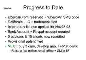
For instance, in its first pitch deck in 2008 presenting its new business model, Uber included traction like five advisors and 15 clients interested in the product. Apparently, it worked!
2. CustDev results
The research should vindicate the wow effect the product is having on consumers. You don’t have to rely on skimpy social-demographic data or survey results. Find a creative approach to the task.
You can for example express your client’s pain through storytelling to put an investor in the user’s shoes. Tinder used this technique in its first pitches when the company was still called MatchBox.
The service’s founders told the story of Matt, who saw a girl at a party but, like many guys, was afraid of possible rejection and did not dare to get acquainted with her. The app helped overcome the fear. Matt ended up finding a girl through the MatchBox app, which allows you to strike a conversation with someone only if you like each other.
Tinder’s example is notable because instead of just talking about the solution, the founders tell the story of a customer’s journey, emphasizing the highlights with screenshots.
3. The immediate value confirmation of a product
By doing this, you can determine if clients are ready to get on board here and now. In addition, it is possible to build a hypothesis about the demand when the product integrates fully in a highly competitive market. Take Educate Online as an example.
The startup developed an online platform through which students can learn online in the best international schools. Educational institutions saw the potential of the platform even before the pandemic.
In late 2018, a Florida school offered to collaborate. Thanks to this, by the beginning of the COVID-19 crisis, the startup had already managed to test the new format. It was ready for the mass transition to online tuition better than its competitors.
Thus, as we can see from these three examples, for an investor who assesses a product’s disruptive potential, a startup’s performance in the early stages is secondary.
To substantiate the project’s market-shaking potential, the founders must demonstrate a profound comprehension of its customers and its pains and get the audience to confirm its value.
Here’s why digital agencies must push clients towards accessibility
When you run a digital agency , your work doesn’t just influence your own results . It can have a direct impact on the success of your clients and as someone who runs a digital agency , this is a responsibility I take quite seriously.

Whether it’ s web design or Google Ads , staying on top of the latest trends is essential for helping my clients achieve their goals.
But while marketing trends may come and go, certain things are poised to have a lasting impact on the way we do business online . One of the most important areas that is gaining increasing attention is ADA compliance for websites.
By addressing the requirements of individuals with special access needs, digital agencies can help their clients achieve greater growth . On the other hand, failing to implement these changes in a timely manner could create serious problems for you and your clients .
The relationship between ADA compliance and web accessibility
The Americans with Disabilities Act (ADA) was passed in 1990, with the specific goal of protecting individuals with disabilities from discrimination in public life . As a result of this law , businesses , schools , government buildings, and other facilities were required to make accommodations to ensure equal access for individuals with disabilities.
The outcomes of this act were wide-ranging, including stipulations such as closed captioning being made available on public service announcements and making alterations to buildings to eliminate architectural barriers that would keep someone from being able to get inside.
Though the act was initially designed to address physical locations , we have shifted to an increasingly digital way of life . Statista reports that over 300 million Americans use the internet , with only 10 percent of the population staying offline . We use the internet for shopping , news , entertainment and more.
However, individuals with disabilities frequently encounter barriers that limit their access to online resources. Those who are blind, deaf or have mobility limitations generally require assistive devices to use the internet . To alleviate this, the Web Content Accessibility Guidelines have been introduced to help website designers ensure that such needs are addressed, further linking the ADA to the internet .
The current state of the internet
While guidelines to address the needs of individuals with disabilities have been made available and widely publicized, many continue to encounter obstacles. In fact, an analysis of 10,000,000 web pages from accessiBe found that 98 percent of websites failed in at least one WCAG compliance guideline — even though the study admittedly did not count “minor” fails that only occurred once in a website’s evaluation.
Despite this, the majority of websites had compliance fails in multiple areas, including menus, popups , forms and buttons.
Regardless of the type of failure , the end outcome for the user is the same. Someone using a screen reader would be unable to navigate a website if a popup wasn’t labelled properly. Others depend on keyboard -only navigation , and can’t use a site if the menus don’t accommodate this feature .
When websites fail to comply with WCAG guidelines, they are essentially violating the non-discrimination ideals of the ADA. This can have serious repercussions for your clients , and for your digital agency .
Why digital agencies must lead out for an ADA-compliant future
Courts are increasingly viewing website accessibility as something that falls directly under the ADA. As just one recent example, Lexology reports that Massachusetts Institute of Technology and Harvard University are each facing million dollar settlements because of failures to provide closed captioning for online content .
Such lawsuits are certainly problematic for these major universities . For one of your clients , it could be completely devastating. The negative publicity, punitive damages and cost of reworking their website to account for accessibility would cause lasting damage. It might even put them out of business .
Even without a lawsuit , failing to account for web accessibility can result in lost revenue for your clients . The 2019 Click-Away Pound Report reveals that in the United Kingdom , retailers lose approximately £17.1 billion (roughly $21.3 billion) each year when disabled individuals abandon a site after encountering an accessibility barrier.
If your digital agency is in charge of a client’s website design, you are the one who is ultimately responsible for these losses. Failing your client in this way hurts the client and their customers . It will likely also come back to create problems for your agency . Web design agencies have been sued for breach of contract because of low-quality work — and a website that causes a client to get sued would certainly qualify.
In the long run, non-accessible web design that hurts your clients will harm your agency through negative reviews , potential lawsuits and lost clients. Taking the initiative in ensuring that you provide ADA-compliant results for your clients will help everyone accomplish their goals, and most importantly, ensure that a vulnerable group has equal access to online resources.
Web accessibility is a win-win
There’ s no denying that helping your clients ’ websites meet all WCAG web accessibility requirements will require a bit more work. But this is well worth the investment.
By ensuring ADA compliance, you ensure that individuals with disabilities have the equal access they deserve. You will help your clients avoid lawsuits and increase revenue .
When all these pieces fall into place , you will ultimately be able to establish your agency as a proactive, innovative leader — something that is sure to pay dividends for years to come.