Illustrator
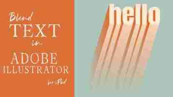
Teacher Fine Art How to Blend Text in Adobe Illustrator for iPad
** Please note, this post may include affiliate links. When you click the affiliate link, I may receive a small compensation, at no cost to you. I only recommend products, or services, that I use myself in my regular creative practice. Thank you for reading!
Hey everyone… Welcome back!
Adobe has added so many new features to Illustrator for iPad since I created my “Beginner Guide to Adobe Illustrator for iPad,” class on Skillshare that I wanted to create some supplementary tutorials to go through some of those additions.
In this tutorial, I’m going to show you how you can blend text using the Object > Blend tool in Adobe Illustrator for iPad. It isn’t as straightforward as you might think; there are some steps you need to take to prepare your text before it will work and I will walk you through all of them.
Let’s get started!
Step 1: Create Your Text
We’re going to start out by creating a line of text. I’m going to start with a single line, make all the adjustments I need to make, then duplicate the final text line so we can create the blend. It prevents you from having to do double the work.
I like to use a nice, heavy weight font for this but you can use any font you would like. (I’m using a font called, “Anton” here)
I’m also going to duplicate this line of text and turn off one of the layers; I’ll be using that later but we’ll just tuck it aside for right now.
An important note… blending in Adobe Illustrator for iPad only works on paths or groups of paths. As you can see here, we have a text layer (you can tell because it shows the actual word you typed and not “path” or “group”) So, we need to convert this…
Step 2: Create an Outline from Your Text
The first thing I want to do is create an outline from my text. This is going to turn my text from a text layer in to a group of compound paths.
You will get something that looks like this when you’re done…
If you open up the group, you will see several sublayers of compound paths beneath it.
Step 3: Release the Compound Paths
This might sound counterintuitive but, at this point you want to release the compound paths. When you do, you’re going to notice that anywhere you have a cut out (for example, in my e and o in hello), the space will fill in with a new shape. Mine looks like this (a note… I also changed the fill of mine from black to red)…
Step 4: Use the Shape Builder Tool to Remove the Cutouts
So, now we need to remove those excess shapes, wherever they exist but keep the paths in place. We’ll do that using the Shape Builder Tool.
With the layer selected, go to Shape Builder and select, “Exclude Overlaps.”
Your layers will look exactly the same but you will see the cutouts, “disappear.” Now that we have a group of paths, and our letters look the way we want them, we are all set to create the blend!
Step 5: Duplicate Your Text and Change the Fill Color
Since we have made all the needed adjustments to our original line of text, we are all set to create the duplicate text that we will blend with this one.
With your layer selected tap the plus icon in the contextual menu just below your selection. (next to the trashcan) This will give you a duplicate of your group.
Change the fill to whatever color you would like, I’m changing mine to a light blue.
Step 6: Drag the Duplicate in to Place
I’m going to drag my duplicate layer straight down to the bottom of my canvas. If you hold your finger on the touch shortcut, it will constrain proportions and keep it in line with the other, if that’s your goal.
Step 7: Select Both Layers and Go to the Repeat Menu
With both layers selected (either by dragging across them or selecting them directly in the layers panel) go to the Repeat Menu at the bottom and choose “Blend.”
This will automatically create a blend between your top line and bottom line. You should end up with something that looks like this…
If you open the “Blend” layer, you will see your two original groups of paths. At any point, before you finalize your blend by expanding it (we’ll do that later in the tutorial), you can change the fill color of your layers by selecting them.
At this point, you are also given additional tools to make further adjustments to your blend. Let’s take a look at them…
Step 8: Adjust the Blend to Your Liking
There are several ways to adjust your blend, the first being to use the handle in the middle of the blend layer (the one with the two nodes on either end)
Drag either one around to place the group it’s tied to wherever you want.
You can also size your overall shape up, and down, using the handles on the four corners…
You can change the number of steps between your two groups by dragging the double arrow on the side up and down…
You can also make changes to your blend by going in to the Properties menu in the toolbar. You can:
Change the type of blend and choose between Smooth, Steps and Distance
Change the number of steps (up to 1,000) for a smoother transition between the two groups
Change the direction of the blend by reversing the colors
Let’s take a look…
Step 9: Add the Duplicated Text Layer (Optional)
Remember that duplicated layer of text that we turned off in the beginning? Here’s where we will use it, however this is a completely optional step. If you want to further define your letters, at the top of your blended shape, you can add that duplicated layer above your top group.
I typically do this in a lighter or darker color than the one it’s sitting on top of, or in a completely different color all together, like I did below.
Adding this layer also allows you to add texture using clipping masks. If you would like to see a quick way of adding texture in Adobe Illustrator for iPad, check out my YouTube tutorial below. The video covers using AI files as texture, however the same concept applies for adding any sort of image as well.
Alright, we’re in the home stretch…
Step 10: Expand the Blend
When you’ve adjusted the blend to your liking and don’t plan on making any additional changes, you will want to expand your blend. Once you do this, keep in mind, you won’t be able to make adjustments, so be sure you are definitely all set before taking this step.
First, select your blend layer and go to the Object menu on the toolbar:
Once you do this, you will see it change from “Blend,” to “Group” in the Layers panel and there will be a number of layers under the group.
From here, if you wanted to, you could play around with colors in the various layers, add further definition to the bottom of the shape using the pen tool and darker fills, whatever you would like.
That’s it! We’ve Created a Blend with Text!
It may seem like a lot of steps (more than the desktop version) but, once you get the hang of it, it’s pretty simple to create a blend from text. I should note, when creating blends of shapes you create, it’s a lot easier as you are automatically working with paths or groups of paths so you don’t need to convert anything.
If you have any questions about the tutorial above, please don’t hesitate to let me know. If you would like to check out my full class on Illustrator for iPad find it here>> “Beginner’s Guide to Adobe Illustrator for iPad,” out on Skillshare. If you aren’t already signed up for Skillshare, you will receive one month, at no cost to you, to explore all of the amazing classes Skillshare has to offer.**
You can also find a number of tutorials I have created for Adobe Illustrator for iPad, out on my YouTube Channel. Find my channel here.
Thank you for stopping by and happy creating!
** Please note, this post my include affiliate links. When you click the affiliate link, I may receive a small compensation, at no cost to you. I only recommend products, or services, that I use myself in my regular creative practice. Thank you for reading!
How to Convert Text to Shape in Adobe Illustrator
Converting your text to an editable shape in Illustrator will allow you to easily customize your text, combine the text with other shapes, or even use the text as an image mask.
Outlining the text is also a good idea if you are planning to hand off the .AI design file to a print shop or another designer so that they won’t need the original fonts installed to access the file.
Fortunately, converting your text to an editable shape is one of the easiest tasks in Illustrator!
How to Do it With the “Create Outlines” Feature
The best time for you to use the Create Outlines method of converting text to a shape is when sending artwork to a printer or another designer. When you outline text, it prevents the fonts from switching to a default font on another system if the person doesn’t have the font installed.
You should also use this method when you want to customize your text fully.
To convert text to a shape, follow these steps.
Create a new Illustrator document or open the project file Type your text, choose your font, and resize the text Select the text(s) to outline Go to Type > Create Outlines or press Shift + Ctrl/Cmd + O
You can convert point text made by clicking once on the page and paragraph text made by clicking and dragging out a text box.
Format the text as needed by resizing it and changing the font size and color. Once you convert the text to outlines, you won’t be able to edit the text to fix any typos. I recommend saving a copy of your artwork at this stage in case you need to change the text later on.
Now, select your text by clicking on it. The text is underlined when selected. Suppose you have many elements on your page, press Ctrl/Cmd + A to select everything. It doesn’t matter if you select graphics and images, as the outlines won’t affect them.
Convert the text by going up to Type > Create Outlines or pressing Shift + Ctrl/Cmd + O.
You can also outline the text by right-clicking/Ctrl + clicking on the text and selecting Create Outlines.
There will no longer be an underline under the text, and you can now see a blue border around the text, which means it is now a shape.
Customizing the Text
You can now send your artwork to the printer or customize the text using various tools. Since the text is now a vector layer, you can adjust it differently.
Before you customize the text, I recommend ungrouping it so you can edit each letter individually. To ungroup the outlined text, ensure it’s selected, then right-click/Ctrl + click and select Ungroup. You can also press Shift + Ctrl/Cmd + G.
When customizing the text, choose the Direct Selection Tool or press A.
The various anchor points are immediately visible on the shape path after you select the tool.
Click on any point with the tool active to select it, then click it again and drag it around to customize the text.
Repeat the process with as many anchor points as you’d like to alter the text.
You can also use the Pencil Tool by pressing N to customize the text even more.
How to Do it With the Make With Warp Feature
The other method of converting text to a shape is the Make with Warp feature, which is best for when you want to create warped text. You can use this method to add preset warps to your text or create your own warps using specific shapes.
To use the Make with Warp feature, follow these steps.
Open your project or create a new document Add your text and format it as needed Select the text to warp Go to Object > Envelope Distort > Make with Warp or press Alt/Option + Shift + Ctrl/Cmd + W
Select your text, shown by the underline and transform box around the text.
Then go to Object > Envelope Distort > Make with Warp or use the shortcut Alt/Option + Shift + Ctrl/Cmd + W.
This action opens the Warp Options dialogue box. You can select a preset warp shape from the Style drop-down menu.
You can also change the settings by changing the warp orientation between horizontal and vertical.
Horizontal:
Vertical:
Adjust the amount the text bends using the Bend slider or add an amount in the box.
Change the Horizontal and Vertical distortion, which affects the perspective of the text, by adjusting the sliders.
The text on your canvas changes in real time if you check the box next to Preview.
Once you are happy with the effect, press OK, and your text is warped.
Once you’ve selected OK, you can further adjust the text using the Direct Selection Tool (A). Select the tool, click on a point on the mesh that covers the text, click the anchor point again, and drag to distort the warped text further.
Make With Top Object Feature
If you don’t like the preset warp options, you can warp the text using any shape. To do this, add your text to the page, then create a shape over the text using any shape tool.
Then select both layers by pressing Ctrl/Cmd + A or clicking and dragging over both items.
Once you’ve selected the items, go to Object > Envelope Distort > Make with Top Object or press Alt/Option + Ctrl/Cmd + C.
Your text is now warped in the shape you placed on top of the text.
The benefit of distorting the text in this manner is that you can still edit the text. Double-click on the warped text, and you can type in new text without affecting the warp.
Your new text follows the same warp settings.
However, this method doesn’t convert the text to a shape, so use the Create Outlines method after warping the text to send it to a print shop or another designer to preserve the font.
Alternatively, after warping your text, go to Object > Expand to convert the text into a vector shape which you can edit further.
You’ll notice the shape change to an outline by the blue border around the text when you select it. Anchor points appear when you activate the Direct Selection Tool.
Frequently Asked Questions
Is there a shortcut to convert text to shape? Using the Create Outlines method, you can use the shortcut Shift + Ctrl/Cmd + O to convert text to a shape quickly. This shortcut converts the text to a vector object, which you can customize by editing the anchor points or send to the printers while preserving the font. Why does my text not convert to shape? You won’t be able to convert text to a shape if you have locked the text layer or accidentally made a selection of a box around the text with no shape fill or outline. Unlock the text layer in the Layers panel and ensure you select the text layer to convert it to a shape. Can I change the shape back into a text layer? Once you have converted text to outlines or expanded the text, the only way to revert it to a text layer is by using the undo command. If you haven’t made too many edits, you can press Ctrl/Cmd + Z to undo the actions.
However, if you have saved and exited your project when you open it again, you can’t undo the text outlines, so always be sure to save a copy of your work before converting to outlines.
Can I change the size and color of the shape?
Yes, you can change the size and color of the shape after converting the text to outlines. The process is the same whether you ungroup and edit individual letters or the text as a whole.
Select the letter(s) and drag the corner points of the transform box to resize the text.
Use the Fill box in the Appearance panel to change the shape's color.
Illustrator
Adobe Illustrator for Cartography
Back to the GIS Tutorials & Help Page... Back to the SAL Home Page...
See also Exporting from ArcGIS to Adobe Illustrator
See also From GIS to Desktop (Adobe Illustrator tutorials for Cartography from Directions Magazine)
~ ~ ~ ~ ~
Below are a few 'effects' that can be applied in Adobe Illustrator for cartographic enhancement. For the most part, these are tricks that are relatively easy in Illustrator and relatively difficult in ArcGIS...
There are LOTS of other effects in Illustrator. Feel free to experiment with any of the items listed under the Effects menu...
Note that these effects, like any cartographic enhancement, should be used sparingly. In most cases, the goal of an effect is that map reader does not even notice the effect as an effect, they simply find the map easier to read and more appealing to look at.
Transparency (for features, text, objects...)
Drop Shadows
Halos for Text
Inset Borderline Outlines
Blurred (Fuzzy) Polygon Edges
Shoreline Vignettes
~ ~ ~ ~ ~
Transparency
While ArcGIS allows you to set the transparency of a feature layer it is relatively difficult to apply transparencies to individual features. It is also not possible at all to set the transparency of the text or of graphic features (text or legend box backgrounds, etc.)...
The process for setting transparency (or Opacity) in Adobe is basically the same for any object (features, layers, text, graphic objects...)
Using the Selection tool select the object you wish to make transparent
tool select the object you wish to make transparent On the top tool bar adjust the Opacity slider (or enter a number) as desired
slider (or enter a number) as desired Alternatively, you can also adjust the Opacity on the Stroke panel (choose Stoke from the Window menu)
on the panel (choose from the Window menu) If you want to make an entire layer or group of layers transparent you can select the entire layer in the Layers panel and then adjust the Opacity
~ ~ ~ ~ ~
Drop Shadows
Unlike ArcGIS (which simply creates a completely opaque drop box, not really a drop shadow), Illustrator gives you a wide range of controls for the size, direction, type, opacity, and color of your Drop Shadows. Experiment with the settings to get an effect you like...
Select an object using the Selection tool
tool From the Effect menu choose Stylize and then Drop Shadow...
menu choose and then For starters simply accept the defaults and click OK
Now try this again (either use CTRL-Z to undo the shadow you just created or select a different object) This time tweak the parameters a bit - the size of the blur, type, color or direction of the shadow etc...
to undo the shadow you just created or select a different object) To modify an existing Drop Shadow (after it's been created): Select the object that has the Drop Shadow Open the Appearance panel (Choose Appearance from the Window menu or Shift+F6 ) Tweak parameters as desired...
~ ~ ~ ~ ~
Text Halos
Creating halos in Illustrator requires the creation of a second copy of the text letters. One copy is set to the back and enlarged, the other copy is in the front and slightly smaller, creating the effect of a halo. The size of the halo as well as the color of both the stroke and the halo can be adjusted as desired. Note that a similar effect can be used for non-text objects as well.
Lock ALL layers except the text layer that you are applying the Halo effect to
ALL layers except the text layer that you are applying the Halo effect to Optional: Create a new layer (using the Create New Layer icon at the bottom of the Layers panel) Change the name of your new layer to "Text and Halo" or something appropriate by double clicking the layer Move the text layer that you want to have a halo to your new layer (as a sub-layer)
Select all the labels in your original text layer by clicking on the area to the right of the circle next to the layer name A tiny box should appear, and all labels should appear “selected”
With the text selected, use the Selection tool to move your text slightly (if need be you can move it a second time to return it to it's original position) This moving of the text will force Illustrator to recognize the font size from the ArcGIS exported text
tool to move your text slightly (if need be you can move it a second time to return it to it's original position) With the text where you like it (still selected), Copy the entire layer ( CTRL+C )
the entire layer ( ) Paste what you just copied BEHIND your original text by pressing CTRL+B (or choose Paste in Back from the Edit menu) This pastes all your new text into a new sub-layer, directly below/behind the original text layer
(or choose from the Edit menu) Lock your original text layer (but keep the visibility On)
Your newly created copy should be directly below the original text layer and should be selected (if not, select it)
In the top tool bar, set the size of the Stroke for your copied text layer Set it to 1 pt for starters... Do not change the Font size (use the stroke size box not the font size box)
for your copied text layer Set the color for your halo using the Stroke color selector (either in the top tool bar or the main Tools panel)
~ ~ ~ ~ ~
Inset Borderline Outlines
Creating an inset border line is a "classic" cartographic effect, seen on many historical maps. It is especially effective on choropleth maps.
Lock all layers other than the layer with the outlines you wish to change
all layers other than the layer with the outlines you wish to change Open the Stroke panel (choose Stroke from the Window menu or CTRL+F10 )
panel (choose from the Window menu or ) Use the Selection tool (from the main Tools panel) to select a polygon
tool (from the main Tools panel) to select a polygon Optional: Adjust the fill color of the polygon as needed using the Fill color selector from the main Tools panel NOTE: If your color turns to grey after you have chosen a new color: With your polygon still selected, open to the Color panel (Window / Color) Click on the small drop-down arrow in the upper right-hand corner From the dropdown menu, choose “CMYK” The color you chose should appear...
color selector from the main Tools panel Use the Stoke color selector (from the main Tools panel) to choose a color for the outline (stroke) Typically the chosen color for the inset stroke is a similar, darker color a more saturated and/or less bright or darker hue compared to the polygon fill) Note: if the stroke color turns to grey instead of the color you choose, see Fill color note above Note: by default the stroke is set to be centered on the line so you will not see an inset yet
color selector (from the main Tools panel) to choose a color for the outline (stroke) With the polygon still selected, go to the stroke window For Align Stroke: choose Align Stroke to Inside (the middle icon) Adjust the stroke Weight: (start with a width of 2 pts) For the Corner: choose Round Join (the middle icon) This should give you the above look....
~ ~ ~ ~ ~
Blurred Polygon Edges
Adobe Illustrator has a number of different effects for blurring objects, softening their edges and giving the features a fuzzy border.
NO blur:
Gaussian Blur:
Radial Blur:
Select the layer (or more likely, the entire group of layers) to add the blur effect to in the Layers panel Alternatively you can choose individual objects using the Selection tool
From the Effects menu, choose Blur and then Gaussian Blur... For now accept the defaults and click OK Your polygon edges should now be blurred...
and then Use CTRL+Z to undo the blur you just applied
to undo the blur you just applied Apply the Blur to the same features a second time: This time use the Radial Blur... option Again accept the defaults and click OK
to the same features a second time: Use CTRL+Z again to undo this second blur
again to undo this second blur Now, choose the type of blur you like better (Gaussian vs. Radial) This time tweak the parameters a bit to see how they change the blurriness
Choose a type of blur you like for the final version...
To modify an existing Blur effect (after it's been created): Select the object(s) that have the Blur Open the Appearance panel (Choose Appearance from the Window menu or Shift+F6 ) Tweak parameters as desired...
Shoreline Vignettes
Adding a shoreline vignette softens the transition from land to water and can provide the illusion of depth for the water.
If you have a water layer (ocean or lake) you can apply an "Inner Glow" effect:
Select your water layer
From the Effect menu choose Stylize and then Inner Glow... For the Mode: choose Screen For the Opacity: choose 60% (experiment to your liking) For the Blur choose a size to your liking... Choose Edge (as opposed to Center)
To modify an existing Glow effect (after it's been created): Select the object(s) that have the Glow Open the Appearance panel (Choose Appearance from the Window menu or Shift+F6 ) Tweak parameters as desired...
Alternatively, if you do not have a water layer, you can apply an "Outer Glow" to your land:
No Glow:
Glow effect:
Select the land (e.g., the continents) layer in the Layers panel
From the Effects menu choose Stylize and then choose Outer Glow... Experiment with the Mode, color, Opacity and Blur size Start with Normal or Multiply for the Mode You'll probably need a fairly large Blur size
and then choose To modify an existing Glow effect (after it's been created): Select the object(s) that have the Glow Open the Appearance panel (Choose Appearance from the Window menu or Shift+F6 ) Tweak parameters as desired...
~ ~ ~ ~ ~ ~ ~ ~ ~ ~ ~ ~ ~ ~ ~ ~ ~ ~ ~ ~