Solving top four car user interface problems with good design
The automotive human-machine interface is the prime point of interaction between driver and car. Drivers use HMI to set climate preferences, change car suspension settings, play favorite music, and do dozens of other things. With the ongoing integration of computer systems into vehicles, automotive HMI is quickly becoming an integral part of the vehicle. Users often evaluate car experience based on the experience they have with HMI.
The design of automotive HMI should be humane-first, and in this article, I will cover four major problems that designers have to overcome to achieve this goal. The insights mentioned in this article are based on experience working with leading car manufacturers like Mitsubishi, Mercedes Benz, GAC Motors, and many others.
Bad learnability
Learnability is a major factor that influences user experience. Generally, the more features the system offers, the more time it takes for the new users to learn how to use it. With more and more car features added, modern human-machine interfaces are growing in complexity.
Users rarely read product manuals and instructions; they learn things by doing. Some users tend to learn how to use the system on the go (while driving)—no need to say that severe increases the risk of car accidents.
A good user interface is invisible. It gives users the information and features they need when they need them. Designers need to craft HMI in a way that minimizes complexity and prevents cognitive overload.
Product design processes should always start with learning user needs and understanding the use context. The goal is to define critical scenarios of interaction. Once you do that, you can go to the drawing board and prioritize features.
In the context of a car user interface, it’s vital to:
Ease of mapping . Show the frequently used controls such as climate control or navigation upfront so that the user doesn’t need to spend any time finding them.
Measure the time it takes users to complete a particular operation (i set a destination in the navigation system or set a comfortable temperature). Validate your design in realistic situations (i a user changing radio stations while driving). If it takes more than a few seconds to do that, it’s time to go back to the drawing board and redesign this feature.
Consider user mental models. User mental models are expectations users have about your car HMI based on their experience with other cars. If a person changes car models, they shouldn’t have to learn how to use the system from scratch.
Distraction while driving
The nature of driving a car has not changed much since the beginning of the automotive revolution (early 20 century). What has been changing drastically is the integration of electronics in modern vehicles. Large displays of modern car user interfaces demand a lot of driver’s attention and can have a negative impact on safety.
Since touch-based displays don’t have physical buttons, users cannot rely on muscle memory to change settings and don’t receive direct mechanical feedback that helps them understand the result of the operation.
The USA National Highway Traffic Safety Administration guideline states that drivers’ eyes should be looking at the road ahead. But when drivers have to glance at large displays while driving, this might lead to car accidents.
The HMI should be designed so that the driver’s attention to the system displays should remain compatible with the attentional demand of the driving situation.
First, the system should not force users to keep a lot of information in working memory. Users cannot keep a lot of information in short-term memory so that the system should answer the key questions that users might have on the home screen (i What is the current speed? How many miles can I go on this tank? What is the temperature in the cabin?).
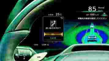
Manufacturers should provide this information either in the instrument cluster or in the head-up display . The latter is preferable because drivers don’t have to look away from their viewpoint.

Second, the system should give users freedom of choice when in selecting an interaction method. The system should support voice and gesture controls to enable the user to say or show what they need, and the system can respond with appropriate solutions.
For example, instead of interacting with the touchscreen to find a restaurant located nearby, the driver should be able to say “I’m hungry,” and a car responds with the most appropriate options. Next, the user can use gestures to select a particular option and set it as a destination.
Old Infiniti Q45 ad that demonstrates the power of voice-based communication while driving.
Last but not least, the system should overwhelm users with too many notifications. Best practice includes postponing the sending of non-critical visual alerts (alerts that don’t have an impact on user safety) till the moment the user stops the vehicle.
One fits all solution
Modern HMI systems are truly powerful—they offer users a lot of options that users can customize for their needs. At the same time, most options remain in their default settings simply because most users don’t change default settings even when the system allows that. As a result, even cutting-edge technology won’t be used to its best advantage.
It’s much better to introduce mechanics that learn about user preferences and suggest changes proactively. The car system should learn and adapt to user needs on the fly. For example, when a car learns that the user is following the same route to work every day and experiences problems with parking, it can find a free parking space automatically and suggest a better time for travel.
The learning process should be fast enough to satisfy the needs of the new generation of users—people who don’t own but rent a car for long or short periods (car sharing).
Emotionless experience
HMI is an integral part of automobiles, and, as was mentioned above, users typically evaluate car experience based on their experience with HMI. Yet, the visual design of HMIs often does not spark any emotions.
Most car manufacturers follow the same approach—they put neon red or blue text on dark backgrounds along with metallic textures. This pseudo-sci-fi aesthetics creates a cold and uninviting feeling right from the beginning.
Ultimately, the goal of visual designers is not (only) to wow the first-time users but to create a visual language that will resonate with users and spark positive emotional responses from them. By improving the system’s visual aspect, we improve how the system is perceived. The attractive design has a better chance of creating a positive first impression and staying in a user’s memory.
Interacting with a voice-based AI assistant. Image by Gleb Kuznetsov
To achieve this goal, you need to:
Think about moments in interactions that can bring moments of joy and delight to customers. The Peak–End Rule suggests that the most powerful user’s positive (or negative) emotions can lead to their long-term Impressions of a product. Designers need to identify moments in user flow where users can experience positive emotions and reinforce them with good design. For example, the moment when a user receives an award for safe driving can be truly memorable.
Constantly collect feedback from people who will drive a car. When you validate your solution, you shouldn’t measure only the functional aspect of the system (i task competition time and the number of errors) but also user satisfaction. It’s important to ask questions “How does this design make you feel?” when you conduct usability testing with real or potential users. Test participants can share their thoughts on your design, and this information will help you identify areas of improvement.
Written by Gleb Kuznetsov and Nick Babich
Researchers develop a unique sound to help you to hear escooters passing by
You might be irritated by the sight of toppled escooters on the sidewalk or people riding them with a beer in hand (hallo, Berlin), there’s a bigger problem afoot — how they sound, or rather, don’t.
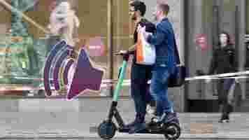
Escooter motors are silent, making it difficult for blind and partially sighted people to detect when a vehicle is approaching.
But now, they are being given their very own sound.
This week, the University of College London’s specialist Person-Environment-Activity Research Laboratory ( PEARL ), joined forces with London escooter operators TIER, Lime, and Dott. They’re working together to research and develop a ‘universal sound’ for rental escooters. This sound will alert pedestrians and other roads users of approaching escooters.
The joint initiative is an industry first and follows extended engagement with disability experts and access consultants. There are currently no standards or regulations in place for audible escooter alerts.

How do researchers develop an escooter sound?
The researchers plan to test a range of combinations of sounds and environments at UCL PEARL with people who are less likely to detect escooters nearby.
The sound will encompass the needs of people with sight loss, hearing loss, and neurodiverse conditions.
According to Dr. Antonio J Torija Martinez, Principal Investigator at the University of Salford, researchers have developed a standalone system to generate sound signals according to the scooter’s operating conditions, such as vehicle speed, and investigated pedestrian awareness of an approaching scooter with a series of added warning sounds.
Notably, there’s also an intention not to add sound pollution to the already loud city streets.
The researchers aim to produce the sound and have it tested by operators in London this year. This will extend to the attainment of an industry-standard, ultimately scaling up to other cities in the UK and beyond.
A good start to improving the relationship between pedestrians and escooters
Ok, so this won’t solve the problem of visually impaired people tripping over abandoned scooters, but it will help reduce collisions. Personally, I’d like to see an escooter make a noxious sound when escooters exhibit noxious behavior like double riding, like a badge of shame. I wonder what other scenarios it could be used in?
What sound do you think an escooter should make?
I’ve been thinking about what noise an approaching escooter should make. It needs to be distinct enough to not blur into the cacophony of the cityscape, but also suitably pitched for those who have lost the upper tiers of their hearing.
Also, it needs to not make neurodiverse people feel more stressed than they should be.
This is a challenge that has already been faced by EV automakers, all of whom have chosen their own sound to denote a traveling EV. According to the team at TNW, some sounds are better than others . The team ranks the sound of the Porsche Taycan Turbo S as the best out of a fairly bad lot, with the Rivian Prime delivery van worthy of being killed with fire.
Then there’s this kinda stuff (shudder):
So, I think the sound would need to be something like this, but softer and still distinctive. It’s a definite challenge for the researchers.
Got a sound in mind? Let us know on Twitter.
The 29 words that’ll make you want to buy an EV — or so says UK gov
The UK government is really keen on getting drivers into electric vehicles. Like, really keen.

It’s so keen in fact, that it’s not only banned the sale of new combustion engine vehicles, but is carrying out “behavioral science messaging trials” to find the best words and phrases to encourage drivers to make the switch.
Before we get to the winning phrase, here’s a breakdown of what the UK government did.
Starting on March 6, 2020, the UK government started displaying messages to people who had just renewed their vehicle tax online. In the UK, drivers pay vehicle excise duty, which is an emissions based tax. (FYI: road tax isn’t a thing.)
The trial ran for 130 days, and tracked the actions and responses of over 4.2 million users of the government’s road duty website.
There were eight messages in total, seven were tests and one was a control. The messages that appeared after the driver renewed their tax, encouraged users to click through to the Go Ultra Low ( GUL ) website , a joint government and industry initiative that aims to promote EV purchases.
The most effective message in getting users to click through was:
Welp, that’s a pretty direct message, to the point. Translating this from government speak to regular English it basically says: “The end is nigh for diesel and petrol, click here, because you’ll have no other choice in 10 years.”
At least those proposed bans on combustion engine vehicle sales are proving to be effective, even before they’re enforced.
Messages, such as the below, which appealed to the community and herd mentality of the public also performed well.
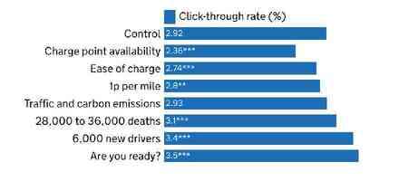
Messages that focused on the availability of charge points, the low cost of charging an EV, and the ease of charging did not appeal to drivers. Given that these are often touted as some of the most important considerations when buying an EV, it’s interesting that people were least responsive to these words.
At the moment it seems that British drivers care about two things: changing their car ahead of gasoline bans, and keeping up with what everyone else is doing. Everything else is perhaps too complicated to consider before actually buying an EV.
With all that in mind, I’ve come up with a new marketing slogan for all EV makers, and governments to use: “Buy an EV, everyone else is.” Please send my royalties in Bitcoin.
The government’s full report can be read here .
SHIFT is brought to you by Polestar. It’s time to accelerate the shift to sustainable mobility. That is why Polestar combines electric driving with cutting-edge design and thrilling performance. Find out how .