Tips for planning and laying out your brochure.
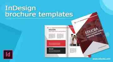
InDesign brochure templates
Introduction to InDesign Brochure Templates
InDesign Brochure Templates can understand as create the layout of brochures of different professionals for advertising their business and its purposes. Creating Brochures templates is totally depends on your creative ideas, but we need powerful software for having our imagination come true. Here in InDesign, it offers us many tools and features which we can use for creating an effective Brochure design. Today in this article, we will use some of the tools of the tool panel with some features of an additional panel of the panel section and also learn how we can use an image in our Brochure.
How to Create Brochure Templates in InDesign?
For creating a Brochure template, we must analyze the text content for which we are going to design the layout of a brochure and then we should choose an image that expresses the purpose of that content. So let us find how we can do this.
Start Your Free Design Course 3D animation, modelling, simulation, game development & others
I will first click on the Create New button of the welcome screen to have a New Document dialog box and then choose this Tabloid size of the document.
I need two columns in my brochure so that I will enter 2 as values of a column in this dialog box.
Now I will choose an excellent gutter value for the column so that when we fold this brochure from the center, then there will be a nice gap between them. A gutter is a gap between columns.
Now I will take the Rectangle Frame tool for creating a frame in which I will place an image.
I will draw it like this and then take the Direct Selection tool.
And move these anchor points in an upward direction for having this type of frame.
Now I will place an image in it. So being selected for this frame, I will go to the File menu and click on it. From its drop-down list, I will choose the Place option, or you can press Ctrl + D as its shortcut key.
I will select this beautiful image from its saved location. I have downloaded this image from
It will come like this, and you can notice that the image is not perfectly fit in this frame.
So I will make right-click on it, then go to the Fitting option of the scroll-down list and choose the ‘Fit Content to Frame’ option from the new scroll down the list of the Fitting option.
Now it will fit in the frame. You can see the quality of this image is a little bit pixelated.
So for this again, make right-click on this image and go to the ‘Display performance’ option of the scroll list, then choose the ‘High-Quality Display’ option.
Now I will adjust this image for adjusting it properly with the document area.
After this, I will make a copy of this image and delete this image from the frame.
I will fill this color to the frame and down its opacity from the opacity option of the properties panel, which you can find at the top of the working screen.
And set it at the top of the image frame so that we have a nice yellowish effect on the image.
Now I will take the Type tool and paste this text here.
I want to make this text a heading, so I will increase its size and change its font style to this font style.
Now here I want to have Grids so that we can perfectly align our content according to our design layout. So for enabling the grid to go to the View menu, and here in the scroll-down list, we have the ‘Girds & Guides’ option, then in the new drop-down list of this option, we have the ‘Show Baseline Grid’ option or ‘Show Document Gird’ option. This time I will enable the Document gird option.
Here we have this type of grid, but I want to adjust this grid according to my requirement.
For adjusting it go to the Edit menu and go to the Preferences option of scroll down list, and in the Preferences option, we have the Grids option so that I will click on it.
And here, I will change the gird size as 5 inches.
Now I will do one more thing here that enables the ‘Snap to Document Gird’ option.
Now you can see we have a good base for aligning our text.
I will change the color of this text to something dark shade of blue.
Now I will add these four subheadings here according to my text content. So now you can see there are not perfectly aligned.
So for that, I will go to the Window menu of the menu bar, and in the scroll-down list of it, we have the ‘Object & Layout’ option. Here in the new scroll-down list of it, we have Align panel option, or you can press Shift + F7 as its shortcut key.
And I will align it, and for align, then first I will click on the ‘Align bottom edges’ option of the Align panel, so that bottom edges of text-align to each other.
And for maintaining equal gaps between them, I will click on the ‘Distribute left edges’ option.
Now I will paste this body copy text here.
I will add some design shape elements here like this by using this software’s pen and shape tool. In addition, you can use the artwork of other software as a design element here.
Now for the next folding page of this brochure, I have created this shape element and added my text content here.
I will add more content here according to the design layout, and I also made some changes in the color of the design element. So you can make changes at any time in your design if you are not satisfied with it.
You can also change the background colour, and you can see this is an excellent brochure layout design.
Conclusion
I am sure you have now an idea about Brochure template design, and you have made a good analysis throughout this article. So now I will suggest you start designing a Brochure with your own idea and use above discussed element for having effective results in your work.
Recommended Articles
This is a guide to InDesign Brochure Templates. Here we discuss how to create brochure templates in InDesign along with the step by step. You may also have a look at the following articles to learn more –
0 Shares Share
How to design a brochure: the ultimate guide
Unless you’ve been living under a rock your entire life, you’ve definitely been handed your fair share of brochures. Whether you’re trying to drive traffic into a new gym location, showcase a property for sale or get the word out about your business, brochures are powerful and effective tools for engaging and educating any audience. But only if your brochure design is on point.
When it comes to brochures, it’s all about the design. A great design will compel your audience to read all about what you’re doing. A less-than-stellar design will end up in the trash can.
Brochures can be powerful – if you do them well. Design by Amrita.
So how, exactly, do you design an awesome brochure? Never fear, we’ve got the ultimate guide to brochure design. By the end of this post, you’ll have everything you need to create, design, and print a great brochure that drives results and makes a lasting impact on your target audience.
How to design a brochure
—
Before you start designing your brochure
—
The key to creating an ah-mazing brochure actually starts before you design. When you do the legwork before you start designing—by knowing your brand personality, message, and target customer—you’ll make the design process go a lot more smoothly.
Know your brand personality
Do you know who you are? Knowing your brand personality is a must. If you don’t know your brand inside and out, all of your branding materials—including your brochures—will feel disjointed and unclear.
This bright, cheerful brochure is perfect for their ideal audience – kids and parents. Brochure design by Adwindesign for Activate The use of green is perfect branding for this environmentally-conscious trash and recycling service. Brochure design by –Hero for VIP This playful design is perfect for this doggy day care pamphlet. Brochure design by Rose” for Dr. Dave’s This brochure feels professional, which is the right vibe for a software start-up. Brochure design by Achiver (d design) for Adaptive
For more on how to define your brand personality, check out our in-depth guides on:
Define your ideal customer
Before you start designing your brochure, get crystal clear on who you’re designing for. Different audiences require different designs, and if you’re not clear on your audience, you run the risk of making the wrong design choices.
In order to design a great brochure, you need to know your audience. Brochure design by Adwindesign for SpinSci Technology
Ask yourself:
Who is my ideal customer?
What kind of information are they looking for?
Are they more likely to respond to more images or more text?
What kind of copy do they expect? Corporate or conversational? Humorous or serious?)
What can I do to best grab their attention?
When you know who you’re designing for, use that to steer your design decisions. You’ll end up with a brochure that feels true to them, which will help up your chances of success.
Develop your message
Check your inbox We've just sent you your free brochure ebook. Want to learn how to create the perfect brochure for your brand? Enter your email to get our free brochure ebook, along with creative tips, trends, resources and the occasional promo (which you can opt-out of anytime). Zionks! Looks like something went wrong.
We touched on this above, but before you design your brochure, it’s so, so important that you define your message.
You need to know what you’re going to say in your brochure and how you’re going to say it before you even think about getting a design in place. Because your message is the most important thing. It all comes back to knowing your customer. If you don’t have a strong, clear message that speaks to them in language and images they can relate to, it doesn’t matter what design you come up with. Your brochure will fall flat.
This brochure’s message is clear – and yours should be, too. Brochure design by Rose” for Big Wave Digital
For example, let’s say you were designing a brochure for new parents to advertise your children’s gym. Your message might be: “We’re fun and friendly—come join us!” So you want to use accessible, simple, friendly language and bright, vibrant imagery to match your brand and appeal to your target audience. Using complex language likely wouldn’t make sense to your customers.
On the flip side, if you’re designing a brochure to advertise your services as a financial advisor, your message will likely be quite different, so using simple language and bright imagery could feel too childish, and your ideal client wouldn’t take your message seriously.
Know your message before you design so you can make design decisions that strengthen your messaging.
Determine your metrics for success
Brochure design by Adwindesign for OFS metrics
Having metrics in place should be a non-negotiable for every brochure you design. Without metrics, you’ll have no idea if you should keep rolling with the same design for future brochures, or if you need to totally overhaul things to drive more results.
Before you design, determine your metrics by defining what you’re hoping to get out of your brochure. Here are a few ideas:
Are you looking to drive people into a retail location? Include a coupon or voucher and measure how many of them are redeemed at your store.
Are you trying to drive people to your website? Include a custom URL on the pamphlet and track the number of visitors during the campaign.
Are you trying to build buzz around a new product launch? Include a CTA to sign up for your email list to get updates and see how large your list grows during the campaign.
Set your budget
Knowledge is power – especially when it comes to your budget. Brochure design by Mj.vass
Your budget is more than just knowing how many brochures you can print. It determines everything from your type of paper to the fun printing techniques you can use to jazz up your brochure.
Come up with a budget-per-print and start making some decisions based on what’s most important. Do you need your brochures to be extra sturdy? Invest in a thicker paper. Do you have a cool idea on how to illustrate one of your points? Look at more expensive ink options and printing techniques to bring your visuals to life.
Knowing how much cash you have on hand for the design and printing process will help you make the best decisions for your budget and squeeze the most out of every dollar.
Designing your brochure
—
Remember your brand identity
As you’re starting the design process, keep your brand identity front of mind. These elements describe the visual look and feel of your brand, and no matter what kind of brochure you’re designing, it needs to be consistent with your overall branding.
Choose design elements (colors, fonts, and images) that match your brand personality and the tone and content of your brochure. If you’ve already set your brand color and fonts, make sure you carry them over into your brochure design.
Haven’t ironed out your brand design standards? Check out our post on how to create a brand style guide for a how-to.
Design with the reader in mind
As a business owner or designer, it’s easy to get caught up in what you want. But, real talk? What you want doesn’t actually matter. It’s what your customer wants that counts.
When you’re designing your layout, keep your reader in mind. How would your ideal customer want to receive information? Are they OK with big blocks of text, or do they need things to be broken up with images so they don’t feel overwhelmed? Are their specific colors or fonts that would be particularly appealing to them? Where can you put all of your information (like your business name and contact information) so it’s easier for them to find?
When you’re designing, make sure to lay things out in a way that appeals to your customer.
Choose your brochure type
You might think “Well, isn’t there just one brochure type… you know, like a brochure?” And the answer is no. There’s a laundry list of options when it comes to choosing your brochure type and the way it’s folded.
According to printing resource Printaholic, there’s a whopping 15 ways you can fold your brochure. They include:
Tri-fold Z-fold Parallel fold Roll fold Accordion fold Single gate fold Double gate fold Half + half fold Half + tri-fold Half-fold Half-fold (letter)
The brochure type that’s right for your brochure design is 100% going to depend on the content.
You might keep it simple with a Classic Tri-Fold. If you’ve got a ton of information you need to communicate, go for an option that has more space, like an Eight-Panel Roll Fold or a 16-Panel Fold. If you’re doing a step-by-step product tutorial, use a Four-Panel Roll Fold to make your content easy to follow for readers.
Single Gate Fold brochure design by zeljko_radakovic for Leadership Intelligence LLC
Classic Tri-Fold brochure design by YaseenArt for Unbreakable Security Company Brochure Z Fold brochure design by YaseenArt Half-Fold brochure design by –Hero for Bubzi Co Double-Gate Fold brochure design by –Hero for Quest Theatre
Also consider how your brochure is ultimately going to be delivered.
Are you going to put the brochures on a rack? Are you going to stuff them in a bag with other promotional goodies? Are you going to send them as a mailer? How you plan to deliver or display your brochures will go a long way in determining which fold is the best choice for you and your business.
Gather your copy and images
Have your copy and images ready to go before you start putting pen to paper and creating a design. This will help you make important decisions about layout, length, font size, and more.
But don’t get too attached. Chances are that design restrictions will affect how much text or how many images you can include. Be flexible and make sure your main points make it in.
Start with your ideal amount of copy. Including a lot of copy in your design can deliver a lot of information for your readers. However, those huge text blocks can feel overwhelming and actually discourage them from reading. Shoot for something in the middle.
Use headlines and sub-headers to structure your text and make it skimmable for readers who don’t have the attention span to read the entire thing (and trust us, they exist). Your headline is especially important. You only get one chance to grab your audience’s attention.
Text heavy brochure design by Rose” for Kaizen Outdoor Fitness Graphic heavy brochure design by –Hero for Verl Software
Then, do the same with your images. Gather them all in front of you and figure out which ones will help tell your story and where they should be placed. Your images are the first things people will see, so they should help you connect with your reader and illustrate what you do.
As you develop your design, your copy and image selection will likely grow and shrink. Again, be flexible and use these creative elements to tell the story your audience needs to hear.
Find your style
When all is said and done, it’s the stylistic elements that are really going to make your brochure shine.
Keep it clean and simple
Graphics! 3D Elements! Glitter! ALL THE TEXT!
If your brochure has too much going on design-wise, it’s going to feel totally overwhelming to your reader. You don’t want to overcrowd your brochure design with too much text, too many graphics, or too many different design elements that compete for your reader’s attention. Keep your design clean, simple, and easy-to-digest for the best results.
Hand-drawn illlustrations make a brochure stand out. Brochure design by Luz Viera for Layers
Think outside of the box
Stock brochure design… It can be a major yawn.
Consumers these days are savvy. They don’t want a bunch of the same old, same old. So if you want your brochure to make an impact on your audience, it can’t look like every other brochure they’ve had in their hands for the past 10 years.
When it comes to brochures, the best designs dare to be different. What can you do that no one else has done before? The more you rock the boat with your brochure design, the more it’s bound to grab people’s attention.
Focal point = your CTA
The reason you’re designing your brochure in the first place is to encourage your readers to take action. And if you want them to take action, you need to tell them in a big way.
If your CTA is buried in a mountain of text in the last paragraph on the last page of your brochure, guess what? No one’s going to see it. If you want your CTA to actually inspire people to take action, make it big, bold, and impossible for them to miss.
It’s pretty clear what you’re supposed to do here… you know, discover Africa. Brochure design by Bella” for Discover Africa
Give your CTA center stage. Put it in multiple places on your brochure. Make it so that no matter how far into your brochure they read, they won’t miss your CTA. Because the more front-and-center you put your CTA, the more people will actually take action.
Evaluating and printing your brochure
—
Your brochure is designed and you’re almost ready to roll it out to the masses. But first, make sure it’s perfect.
Evaluate your design
Once your brochure is designed, take your time to evaluate the final product. Now is your last chance to make changes and get your design right.
Check your inbox We've just sent you your free brochure ebook. Want to learn how to create the perfect brochure for your brand? Enter your email to get our free brochure ebook, along with creative tips, trends, resources and the occasional promo (which you can opt-out of anytime). Zionks! Looks like something went wrong.
Ask yourself:
Does this design grab my attention?
Is my messaging clear?
Does this design point to my CTA?
Is this brochure in line with my branding?
Ask other people those same questions to get an outside perspective. Show your design to your colleagues, customers, even friends to figure out if you’ve got a winner. Once you’re happy, it’s time to get printing!
Choose your printer
Working with a top-notch printer can mean the difference between your brochure design coming to life exactly as you imagined it… Or turning out like some gnarly, bootleg version.
If you can, visit printers so you can see their work in person. Viewing samples IRL will always give you a better idea of what you can expect from your print job than looking at samples online.
Colors and paper can look and feel different when a design is printed, so make sure to look at samples IRL. Brochure design by Amrita.
When you’re researching printers, ask them questions to see if they’re going to be the best fit for your job. Here are a few examples:
What are your ink options?
What is your best printing option for time? For cost?
Do you do color matching?
Do you offer printed or digital proofs?
What happens if I’m not satisfied with my print job?
Do you have designers in-house?
Do you have experience in brochure printing and design?
Can you provide references for other brochure clients?
Ideally, find a printer who has experience in the brochure space, uses the latest print technology and has designers on staff who can help with any design issues so your print job comes out looking A+.
Choose your print materials
Work with your printer to select the best materials for your brochure. Here’s a little cheat sheet to help you on your way:
Paper weight
Generally speaking, the higher the paper weight, the thicker the sheet. There are a few different ways to measure paper weight (like basis weight and mils), but the most common is metric weight, also known as GSM. The GSM is the weight of one sheet of paper cut into a 1×1 meter square.
Just as an FYI, most brochures fall somewhere between 170 and 300 GSM.
Finish
Once you’ve chosen your paper, it’s time to choose your finish. There are a few different types of finishes to choose from:
Matte: A completely flat finish without any shine
Semi-Gloss: A somewhat shiny finish that falls between matte and glossy
Glossy: A shiny, reflective finish
The finish you choose is all dependent on the look you’re going for. Talk to your printer about the different options you have within your budget and what print materials will be the best fit for your objectives.
Brochure design by zeljko_radakovic for Treat Beauty Brochure design by Rose” for F12 Mastermind
Ink and speciality processes
Some printers also offer specialty inks that can enhance your brochure. Here are a few options you can inquire about:
Foil: A shiny, metallic ink or stamp that reflects light
Embossing: The process of pressing a shape or image into paper to create a raised effect
UV spot: A shiny coating applied only to certain spots of paper (typically a logo, headline, or accents)
Check with your printer if these options (or others) are available and how they might change the cost and production time of your brochure.
Folding things up (yes, that’s definitely a brochure pun)
—
You now have everything you need to get out there and design an incredible brochure. One that will deliver your brand message, inspire your customers to take action, and bring you closer to your goals—one brochure at a time.
Tips for planning and laying out your brochure.
by Ken Black
The most important part of this design hinges on the alignment of the three panels or the folds. Often the creative excitement of starting new work or in the rush to meet deadlines, the positions of these folds may get laid out incorrectly. This occurs by either dividing the sheet into thirds or worse, they have been “eye-balled”.
Now, the printer is calling. I am certain that these words are familiar: “Yeah, the folds are off. Sure, we can fix it for you...at our hourly rate.” or “We can't edit your files. Your going to have to fix it and re-send them. Oh, and that is going to push the completion of your brochure back a day”. This can all be avoided by taking a few simple steps from the beginning.
It is always a good idea to consult with your printer because there is often more than one solution to a folding problem and different printers may have slightly different folding panel measurements. But generally speaking, a folding layout can be determined for any multi-panel folding brochure by subtracting .0625" (1/16") from each panel after the finished size of the two outside panels, while heavier stocks may require adjustment of .125" (1/8"). Also note that some sheet sizes or folding layouts (such as 12" x 9" wrap fold) may require slight back-trimming to make the panels work correctly.
For fold-specific dimensions for most common brochure sizes please see the layout dimensions found in our brochure templates section.
Building a 11" x 8.5" Letter-Fold Brochure Template
For this example, the most common 11” x 8.5” three panel tri-fold or letter-fold is being used. The fold locations for this design are as follows: Outside (l-r) 3.625" and 7.3125", Inside (l-r) 3.6875" and 7.375". As a result, the panel widths are: Outside (l-r) 3.625", 3.6875 and 3.6875", Inside (l-r) 3.6875", 3.6875" and 3.625".
1. Start by setting up the document as 11” x 8.5”, with .25” margins and .125” bleed. The .25" margins act as a safety guide for text and important images such as logos. Keeping these objects within this border ensures that nothing will get cut off at the final trim stage of the brochure. Application Note: Indesign users can set the bleed in the document setup window, Quark 6.5 and 7 users can set the document size and the margins, however, the bleed guides will have to be set manually.
2. Next, create a layer and name it Guides.
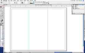
3. Be sure that your documents rulers are zeroed to the upper left-hand corner and on the Guides layer, place a guide at 3.625”, this creates the panel that will fold into the inside on a letter-fold brochure.
Application Note: For Indesign users, guides can be dragged to the pasteboard and their coordinates can be typed directly into the x and y coordinate boxes in the measurements pallete, making for quick and precise placement. Quark users, both 6.5 and 7 will find the Guide Manager Xtension must be used to set guides precisely. If the Xpert Tools Xtensions (free with Quark 7, extra for 6.5) are installed, then you can click on the guide and type the coordinates into the window that opens.
4. Place another guide at 7.3125”, this adds the back panel (middle) and front panel (left) of the brochure. (Fig 1).
5. Next, create another page for the inside of the brochure and place a guide at 3.6875” and another at 7.375”.
6. Click the lock on the Guides layer so it will be locked and not tampered with.
7. Now save the “New and Improved” blank white sheet as a template file. The extension will be .indt for Indesign and .qxt for Quark Xpress. Give the document a generic name that refers to its size, function and finish, for example: 11x8.5_3-panel_letterfold or whatever keeps it organized for yourself. (Fig 2).
By saving the document as a template, the panels and guides are preserved for any future brochure designs and you can be sure that the folds will come out correct every time.
Other design issues that may effect the outcome of the finished piece including topics such as image resolution, color and typefaces can be found through these links:
Printing faqs
File submission faqs
File preperation pitfalls