What’s New With InDesign CC 2019
It’s autumn, so it must once again be time for a brand new version of InDesign! Indeed, Adobe has just released InDesign CC 2019, and I’m pleased to report that almost every InDesign user will find something to smile about. This upgrade brings significant (though often-hidden) changes to the user interface, as well as innovative ways to fit images to frames and to set spacing between paragraphs. A newly revamped font menu gives you more ways to choose and preview fonts. You can import comments from a PDF. And of course there are the usual small tweaks and changes, including some refinements to footnotes and endnotes. Whether you’re a beginner or advanced InDesign user, you’re going to want to check out the new features in CC 2019. (In addition to this article, you may enjoy watching some of Anne-Marie Concepción’s new Lynda/LinkedIn Learning video title that covers each of these new features in depth, InDesign CC 2019 New Features.)
New Version, New Format
It’s important to remember that all major upgrades bring a new file format. This means that if someone using InDesign CC 2019 creates a new file, and you open it using an earlier version of InDesign CC, the Creative Cloud will convert the file backward to your older version. (Or, as usual, you can export IDML for “saving backward.”)
Properties Panel
As you know, InDesign already offers many different ways to apply formatting to text and objects. For example, you can set the font size and leading for a paragraph of type in either the Character panel or in the character formatting controls of the Control panel. Well, now there’s one more: a Properties panel.
Why would you need another panel for applying formatting to text or objects? Adobe has found that InDesign’s plethora of panels and dialog boxes can be confusing, especially for those who are new to InDesign, or who use it less frequently. So, following the lead of Illustrator CC and Photoshop CC, the new Properties panel shows many of the relevant layout commands. And while it doesn’t offer all the same features as the Control panel (which still exists), even if you are an experienced user you may find the Properties panel faster for some of your workflows because most of your needed commands are found in one place.
Like the Control panel, the Properties panel changes based on what’s selected. The mode you’re working in (for example, Text Insertion or Linked File) appears listed at the top of the Properties panel. The rest of the panel is grouped into sections. For example, if you are editing text, the panel configures itself to show sections for Text Style, Appearance, Character, Paragraph, Bullets and Numbering, and Quick Actions (Figure 1).
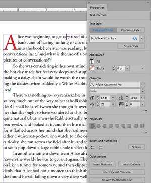
Figure 1. The Properties panel adjusts its appearance depending on what you have selected. When editing text, the Properties panel displays controls that let you edit text style, appearance, and other properties.
A Work in Progress
When you start working with the new Properties panel, you’ll likely find yourself frustrated because it’s just “version 1” and is a work in progress. For example, when you see an ellipsis (…) at the lower right of a section, clicking it expands the section to show additional choices. However, currently the collapsed or expanded state isn’t “sticky” between sessions, so it often closes even when you want it to stay open.
Similarly, many features don’t appear at all in the Properties panel, and the paragraph and character style controls in the panel are very limited, so if you do a lot of work with styles, you’ll almost certainly want to revert to using the Paragraph Styles and Character Styles panels.
Fortunately, it’s likely that the Properties panel will be further developed in future InDesign versions—that’s what’s has been happening in Illustrator CC and Photoshop CC.
Layout Features
InDesign CC 2019 adds an optional new panel for adjusting layouts. It also adds some new features for adjusting the spacing between paragraphs, changing the sizing of page elements, and fitting images using content-aware technology.
Adjusting page size, margins, and bleed
There are many reasons why you might want to adjust the size of a layout, but the three most common adjustments are to page size, margins, or amount of bleed. It’s extremely easy to change any of these in InDesign, but changing them and altering your text frames and other page elements has long been a huge hassle. The new Adjust Layout feature in InDesign CC 2019 comes to the rescue.
The old (and buggy) Layout Adjustment feature found in previous versions of InDesign has now been retired. The Liquid Layout feature is still available, but few InDesign users take advantage of it. (Liquid Layouts provide a rule-based way of resizing pages. You can read about it in “Alternate Layouts” in InDesign Magazine issue #74.) Instead, the new Adjust Layout feature is easy to use and does a surprisingly good job of making changes to page items for you.
You can use Adjust Layout in one of four ways:
Choose File > Document Setup, and click the Adjust Layout button.
Choose File > Adjust Layout.
Click the Adjust Layout button on the Properties panel.
Choose Layout > Margins and Columns, and turn on the Adjust Layout checkbox.
The first three options open the Adjust Layout dialog box shown in Figure 2.
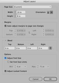
Figure 2. I used these settings in the Adjust Layout dialog box to change slides from 8.5 × 11 inches landscape to 8 × 10 inches.
By the way, InDesign CC 2019 also introduces a new option to adjust your document margins inside the Document Setup dialog box. (Previously, once you created a new document, you could only change margins for selected spreads or pages.)
The Adjust Layout feature can alter your page elements in several different ways, including resizing and moving frames. But it can also (optionally) alter the size of your text on the page. For example, if you’re converting a large A3 poster into a smaller A4 flyer, you probably want all your text to be half as large (and with half the leading). This is a pain to do manually, but it’s just a checkbox away with Adjust Layout (Figure 3).
Figure 3. (a) The original 8.5″ × 11″ layout in landscape orientation (b) Settings used in the Adjust Layout dialog box to reduce the page size and margins, and change the orientation to portrait (c) After making such a radical change some manual cleanup work is needed. (d) The final result
Figure 3a
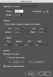
Figure 3b
Figure 3c
Figure 3d
New Spacing Between Paragraphs Option
A new feature with the ungainly name “Space Between Paragraphs Having the Same Style” is a useful addition to setting spacing in the Paragraph, Control, and Paragraph Styles panels. It is particularly useful when setting bulleted lists, numbered lists, and block quotes. It allows you to use one style for lists, instead of resorting to separate styles to create the proper space above and below the list.
For example, you could have a single style that adds Space Below and Space After a paragraph, and then change this “space between” setting to zero points. If you apply this to a group of five paragraphs, the first paragraph would have space before, the last paragraph would have space after, and none of these paragraphs would have space added between them.
We’ll cover how to use this exciting new feature in detail in the next issue.
Content-Aware graphic fitting
InDesign CC 2019 can now attempt to intelligently and automatically fit the best part of an image inside a frame, rather than your having to manually position it. Of course, what “the best part of the image” means is always open to argument, but Adobe is using a machine-learning algorithm—part of their Adobe Sensei artificial intelligence initiative.
Content-Aware Fit is not enabled by default. If you want to make it apply automatically to all placed images, turn on “Make Content-Aware Fit the default frame fitting option” in the General pane of the Preferences dialog box. You may find some type of graphics work well with the algorithm and some may not, so you may need to experiment with the images used in your workflow. In my experience, the feature seems to work better with raster images than with vector graphics.
In Figure 4, I placed six raster images from my sample files using the “gridify” feature, producing a 2 × 3 grid of frames. When the Make Content-Aware Fit preference was turned off, the images were placed using the Fit Content Proportionally option (in Object > Fitting). When Make Content-Aware Fit is turned on by default, the feature did a pretty good job of finding the useful content to include within the frames. Of course, you can continue to tweak the image position manually in individual frames after using the fitting command.
Figure 4a. Make Content-Aware Fit turned off in General Preferences is the default for fitting images to frames.
Figure 4b: When Make Content-Aware Fit is turned on, it does a reasonable job of fitting the best part of the image within the frames.
Note that if you place an image normally and later want to apply Content-Aware Fit yourself, it’s an option in the Fitting submenu, the Control and Properties panels, and in object style definitions.
New Font Features
If you’re like most designers, you spend a significant amount of time picking just the right font, including previewing the way it appears in different parts of your layout. So you’re going to be very happy about a new method of previewing and selecting fonts. Plus, InDesign CC 2019 introduces a new font type that supports glyphs with colors and gradients.
Live font preview when hovering
You can now preview type you have selected in a layout in any font by hovering your mouse over the font name in a list of fonts. This can be used in the Control panel, Character panel, and Properties panel menus. For example, in Figure 5, the heading for a book cover is selected on the page, and in the font family menu, Abadi MT Condensed Extra Bold is being previewed. (In earlier versions, you could do something similar, but you had to hover and also press a modifier key on the keyboard.) You can also preview the currently selected text directly in the font family menu by setting the sample text options pop-up menu to Selected Text.
Enhanced font browsing
To understand some of the type changes in this version, it’s important to know that Adobe has renamed its Typekit service “Adobe Fonts.” Their icon has changed from a TK icon to a “cloud” icon for Adobe Fonts, and the word “sync,” previously used for selecting fonts you want to use, is being replaced with “activate.”
The Cloudy Meaning of “Adobe Fonts”
Adobe has changed the name of Typekit to Adobe Fonts. However, it still appears as Typekit in some programs, such as Photoshop, which will undoubtedly cause some confusion for a while. But the confusion goes deeper than just branding. After all, the font called Adobe Garamond is an “Adobe font,” because it was designed and developed by Adobe. But hundreds of other fonts were designed and developed by other non-Adobe font foundries, and only licensed to be distributed through Typekit. Unfortunately, those are now also called “Adobe Fonts.” So when you’re talking with someone about “Adobe Fonts,” you need to be clear whether you’re referring to the fonts from Adobe or “the service formerly known as Typekit.”
There is an enhanced display of choices when browsing fonts in the Control, Character, and Properties panels font family menus. When you click the Font Family menu, there are two tabs at the top left (Figure 5): the “Fonts” tab shows currently installed or activated fonts. But here’s the cool one that is easy to overlook: The “Find More” tab previews Adobe Fonts that are available to be activated. Yes, that means instant access to thousands of fonts from within InDesign, without having to visit Adobe’s website.
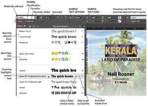
Figure 5. Filters and options for previewing fonts have been added to the Font Family menus. Clicking the Fonts tab shows currently installed and activated fonts. Clicking the Find More tab lets you preview and activate Adobe Fonts (formerly Adobe Typekit fonts).
In both tabs, already activated Adobe Fonts show a cloud icon with a checkmark. If you activate some of the fonts from within a font family, but not all of them, you’ll see a cloud icon with an ellipsis (…) next to it. Non-activated Adobe Fonts show the regular cloud icon (Figure 6).
Figure 6. The Find More tab shows Adobe Fonts (previously Adobe Typekit fonts) and allows you to search, preview, and activate fonts directly within InDesign.
New filtering options for fonts (in both tabs) are available:
A new filter shows recently added fonts.
The Classification filter (Figure 7) shows the same categories and icons that are found on the Typekit/Adobe Fonts website for filtering fonts. There are icons for each of eight classifications that were available in earlier InDesign versions, such as Serif, Script, and so on. You can also select properties for weight, width, x-height, contrast, standard or CAPS only, and Default Figure Style.
Figure 7. The Classification font filter has been expanded to show both the classifications previously shown and properties which are found on the Typekit/Adobe Fonts website for selecting fonts.
The Typekit filter is renamed Show Activated Fonts.
The Add to Favorites star icon and View Similar filter option are now available in-line with the font names.
You now have three options for the size of preview text. Plus, the preview text can be the text you have selected on the page, or you can select between five preset text phrases. By the way, if you hate these kinds of font previews (some people do!), you can turn off the Enable In-menu Font Previews option in the Type pane of the Preferences dialog box.
Support for OpenType SVG fonts
InDesign now supports OpenType SVG fonts, including color fonts and emoji fonts. They appear in a new section of the installed and activated fonts list and have a new font type icon (see Figure 5).
Using Emoji fonts, you can include various colorful and graphical characters, such as smileys, flags, street signs, animals, people, food, and landmarks in your documents. Of course, you can’t just type an emoji inside InDesign, so to insert them, you can copy and paste them from another program, or double-click them inside the Glyphs panel (Type > Glyphs).
Trajan Color Concept—an OpenType SVG font that now ships with InDesign—includes color information, via 20 stylistic sets with various colors and gradients. However, because OpenType SVG fonts are already colored, you cannot apply different colors to OpenType SVG fonts within InDesign. The colors can be viewed in PDF, EPUB, or Publish Online documents. (Just be aware that some PDF and ebook readers may not be updated yet to display this color information correctly!)
TIP: To learn more about OpenType SVG fonts and how to use them, see this Adobe Help article.
PDF Enhancements
InDesign CC 2019 sports three important new features for working with PDFs. You can now import PDF comments, specify font family and style in PDF form fields, and exercise more control over how your PDF files are named.
Import PDF comments within InDesign
Acrobat’s PDF comment and review features are widely used for marking up documents, but there has always been a frustrating limitation: you couldn’t see those comments where you needed to most… on your InDesign page! (There have been some third-party add-ons that have helped with this, including the Annotations plug-in from DTP Tools.) Now, with CC 2019, you can import comments added in Adobe Acrobat or Adobe Reader as part of a review process, and the comments will show in the context of your InDesign layout (Figures 8 and 9). Even better, InDesign can now make some changes for you, including inserting or deleting text that has been marked in the PDF!
Figure 8. In this example, four comments have been added to this single page PDF review using the Comment tool in Acrobat Pro DC—one by the initiator of the review and three by a reviewer. Here, the comments are viewed in Acrobat.
However, there are a few caveats you need to know. First, you can only import comments on a PDF that was exported from InDesign CC 2019 or later. Second, don’t edit the InDesign document before importing comments; otherwise they may not be correctly positioned. And finally, PDFs created using the Book feature won’t work correctly in the PDF Comments panel.
TIP: For earlier InDesign files, open and save the file in InDesign CC 2019 or later and export a PDF file. Then you can use Acrobat to move the comments from an older PDF into the newly created PDF file.
To import PDF comments into an InDesign layout, do one of the following: choose File > Import PDF Comments, or choose Window > PDF Comments to open the Import PDF Comments panel, and then click the Import PDF Comments button.
InDesign’s PDF Comments panel and comment icons look similar to the comment list and PDF markup you see when you choose the Comment tool in Acrobat (Figure 9).
Figure 9. When comments are imported into InDesign, their appearance looks similar to those viewed in Acrobat Pro DC. However, they are now viewed and managed within the original InDesign layout.
PDF form fonts
In previous InDesign versions, it wasn’t possible to specify a font for form fields, such as a text entry field. All the text in the form would appear in Acrobat’s default font, usually Times Roman. But in InDesign CC 2019 you can now select a font family and style for the text in list boxes, combo boxes, and text fields (Figure 10).
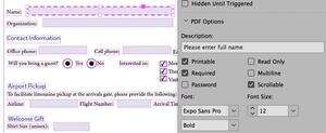
Figure 10. You can now specify the font that can be used for PDF form fields created in InDesign.
However, note that just because you choose a font doesn’t mean your audience will see it. Fonts used for list or combo boxes are embedded (so the final viewer will definitely see them in the correct font). However, fonts you choose for text fields are not embedded in the PDF, and so the end user will only see the correct font if they’re using Adobe Acrobat or Reader and have those fonts active on their computer. If the fonts aren’t present, Acrobat and Reader will substitute Adobe Serif MM or Adobe Sans Serif MM.
Choose file name while exporting as PDF
Finally, here’s a small but welcome improvement: in earlier versions of InDesign, when you exported a PDF, the default file name would be the last one you used for a PDF export—even though the document name may have changed. This would often cause errors or confusion when the PDF name didn’t match the document name it was made from. Now, when you export a PDF, a new checkbox option appears in the Export dialog box: Use InDesign Document Name as the Output Filename. (Note that the new feature also appears and works in other export formats as well.)
Long Document Features
You may know that Adobe uses voting on the InDesign Uservoice site to help determine which new features to add, and one of the top vote-getters has long been “Please make it possible to insert footnotes in tables.” Well, hallelujah: You can now include footnotes within tables. Plus, you can convert footnotes to endnotes and endnotes to footnotes in your document. And, also in the category of long document feature improvements, Adobe made a few small tweaks to the Index panel.
Adding footnotes to a table
In past versions of InDesign, when you imported a Word file with table footnotes, the footnotes would be ignored. Similarly, if your text cursor was in a table, the Type > Insert Footnote feature would simply be grayed out. Now, those limitations are gone.
However, there are three important limitations to adding footnotes to tables:
Table footnotes appear at the bottom of the text frame, not the table (Figure 11).
If your table is anchored in a text story (they often are), the table footnotes are numbered alongside footnotes from the story.
Only one numbering style can be used for both text and table (so you cannot make table footnotes use, for example, “a, b, c…” while the primary story uses “1, 2, 3…”).

Figure 11. Kerala Demographics.pdf. In the Kerala Demographics story, the table needed to be inserted in the story text. Then all the footnotes from text and table number consecutively at the bottom of the text frame.
These limitations will drive some InDesign users crazy, but there is an easy solution, at least for the first two problems: to have separate footnote numbering for a table, and place the numbering under the table rather than at the bottom of the page (interspersed with other footnotes), simply place each table in a text frame of its own. Then, if necessary, you can anchor that text frame into the larger text story. That said, if the new features still don’t meet your needs, check out Peter Kahrel’s article “Going Deep with Footnotes” in InDesign Magazine issue #95.
Enhancements for footnotes and endnotes
As I mentioned above, you can now convert footnotes to endnotes and endnotes to footnotes in your document. To convert footnotes and endnotes, choose Type > Convert Footnote and Endnote. In the dialog box, you can specify whether you want to convert all the endnotes and footnotes in your document or only from the selection. Also, when importing Word or RTF files, there is now an option to place Word endnotes as static notes. Choosing static notes imports endnotes the way they were imported in InDesign CC 2017 before InDesign’s own endnote feature was introduced.
Index panel improvement
Making an index in InDesign has always been hard, but here are two little changes that help: first, the size of the New Cross-Reference field in the Index panel has been enlarged, providing more space to find and locate index entries. Second, there’s now a Find field in the same dialog box to search within the index entries. Simply type the search term in the field, and use the Find Next Entry and Find Previous Entry buttons (arrows) to view the index entries.
Other Small Changes
A few smaller enhancements have been added as well.
Remember previous export format. Now your documents will remember the last file format that was exported from them. This information travels with the document, so when the document is passed to another user, it will still remember the last used export format.
Optional package instructions. Now while creating a package, you have an option to choose whether or not you want to include printing instructions. (Hint: you probably don’t.)
Add to CC Libraries turned off as default. The Add to CC Libraries option is no longer selected by default when you create new swatches, paragraph styles, and character styles. This change is a huge relief for most of us, as it was annoying to see the CC Libraries panel open unexpectedly.
Home Screen/Start workspace changes. The initial screen you see after launching InDesign is now called the Home screen, and it still appears as the Start Workspace. By default, it also appears any time that when no documents are open. You can turn it off by going to the General pane of the Preferences dialog box and turning off Show ‘Start’ Workspace When No Documents Are Open.
Better performance when working with text. Improvements have been made in text performance—for example, in typing, deleting, adding columns, and inserting footnotes—providing a snappier performance. However, note that at the time of this writing, there is a frustrating performance problem that appears the first time you select the Type tool after launching InDesign. Fortunately, this long delay doesn’t appear again until the next time you launch InDesign.
Stability Improvements. The most common sources of InDesign crashes have been fixed.
A Substantial Upgrade
With significant changes to the user interface, strong new features for working with layouts and fonts, and several welcome fixes for existing problems, InDesign CC 2019 will be a welcome upgrade for most users.
Editor’s Note: Check out what’s new with Photoshop CC 2019 and Illustrator 2019 at CreativePro.com